

Natura Musical
Visual Identity
→ 2023
Client: Natura
Agency: Papanapa
Role: Graphic Design, Motion
Creative Direction: Gustavo Garcia
Team: Cassia Freire, Luana Cordeiro, Lucas Rodrigues
Natura team: Beatriz Araújo, Fernanda Alves, Marcel Vieira, Renan Anjos
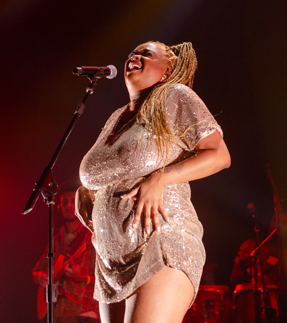
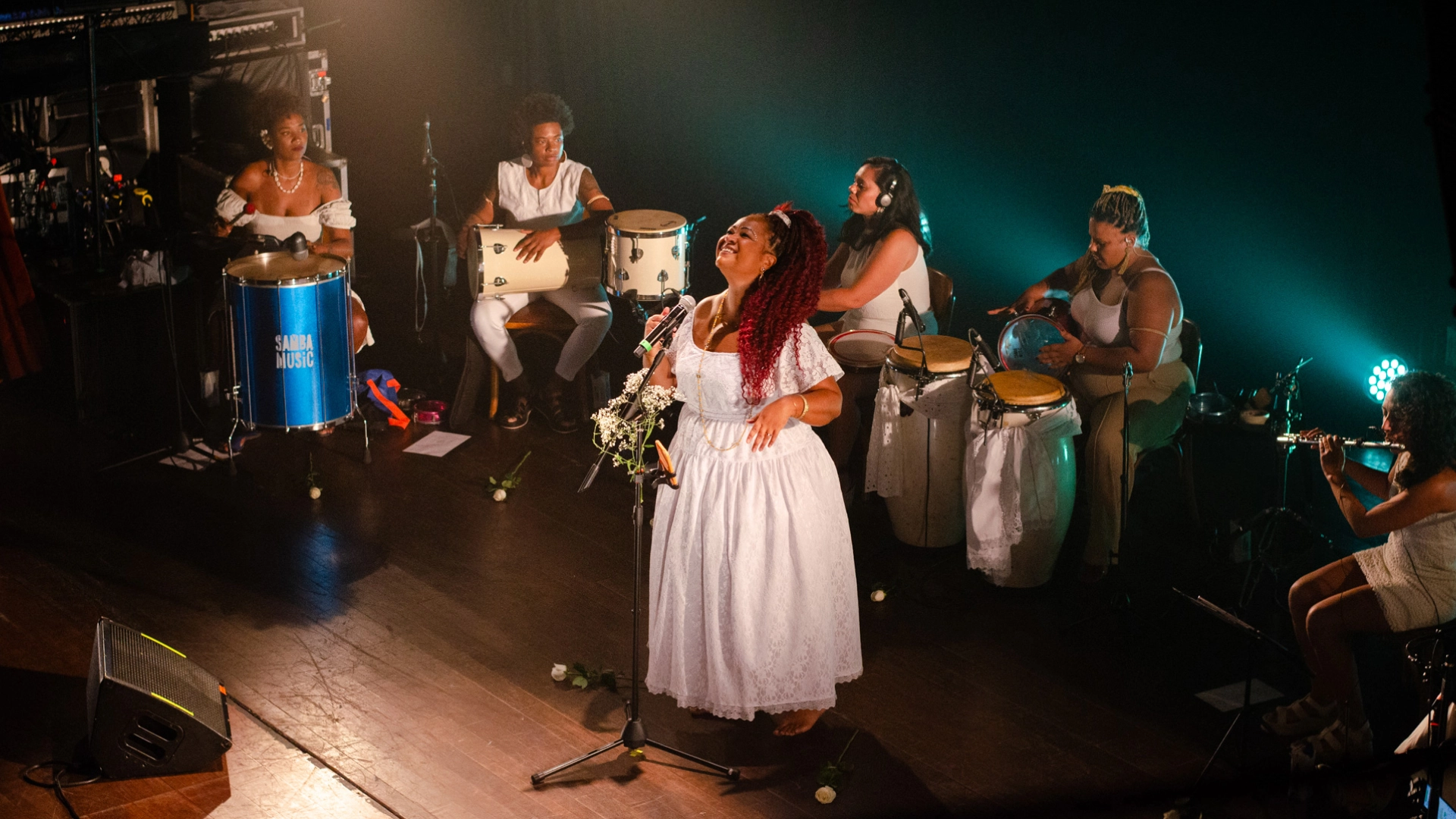
Photography: Caio Henrique, Karol Leal, Lucas Lourenço, Yasmin Passos
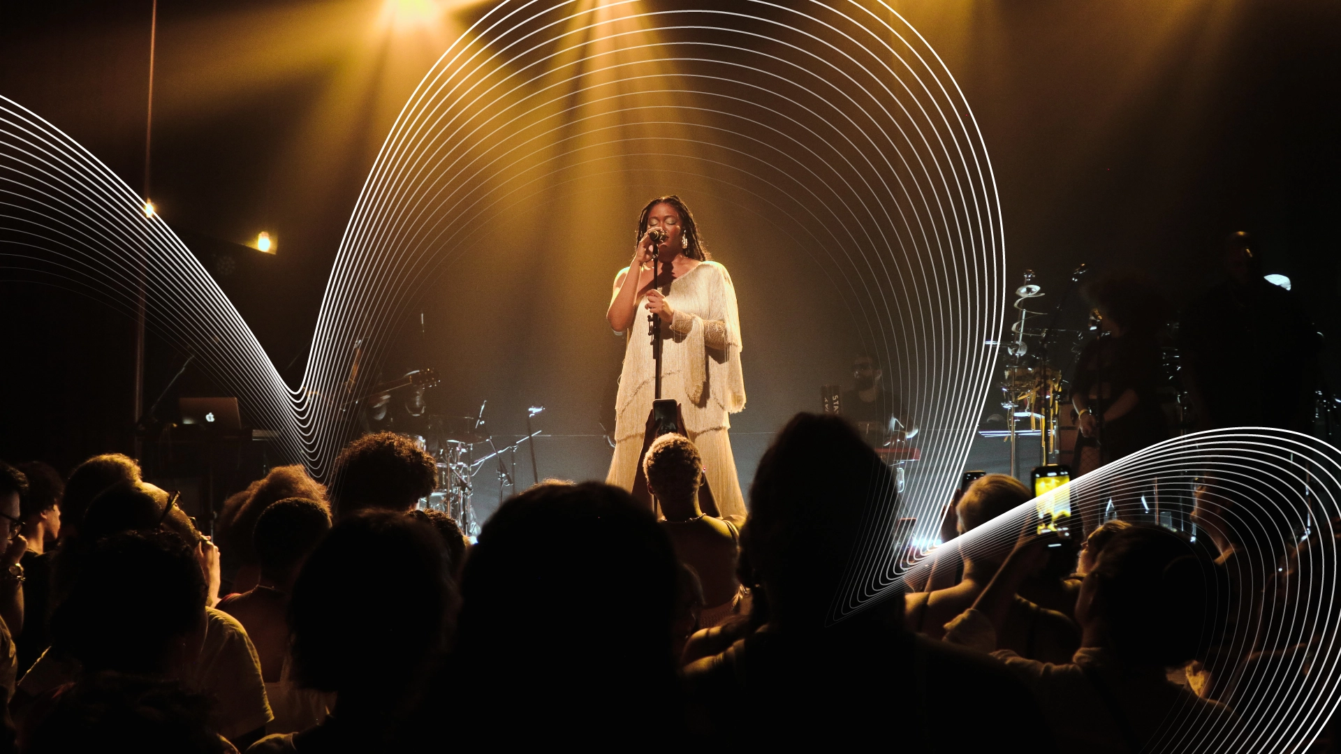
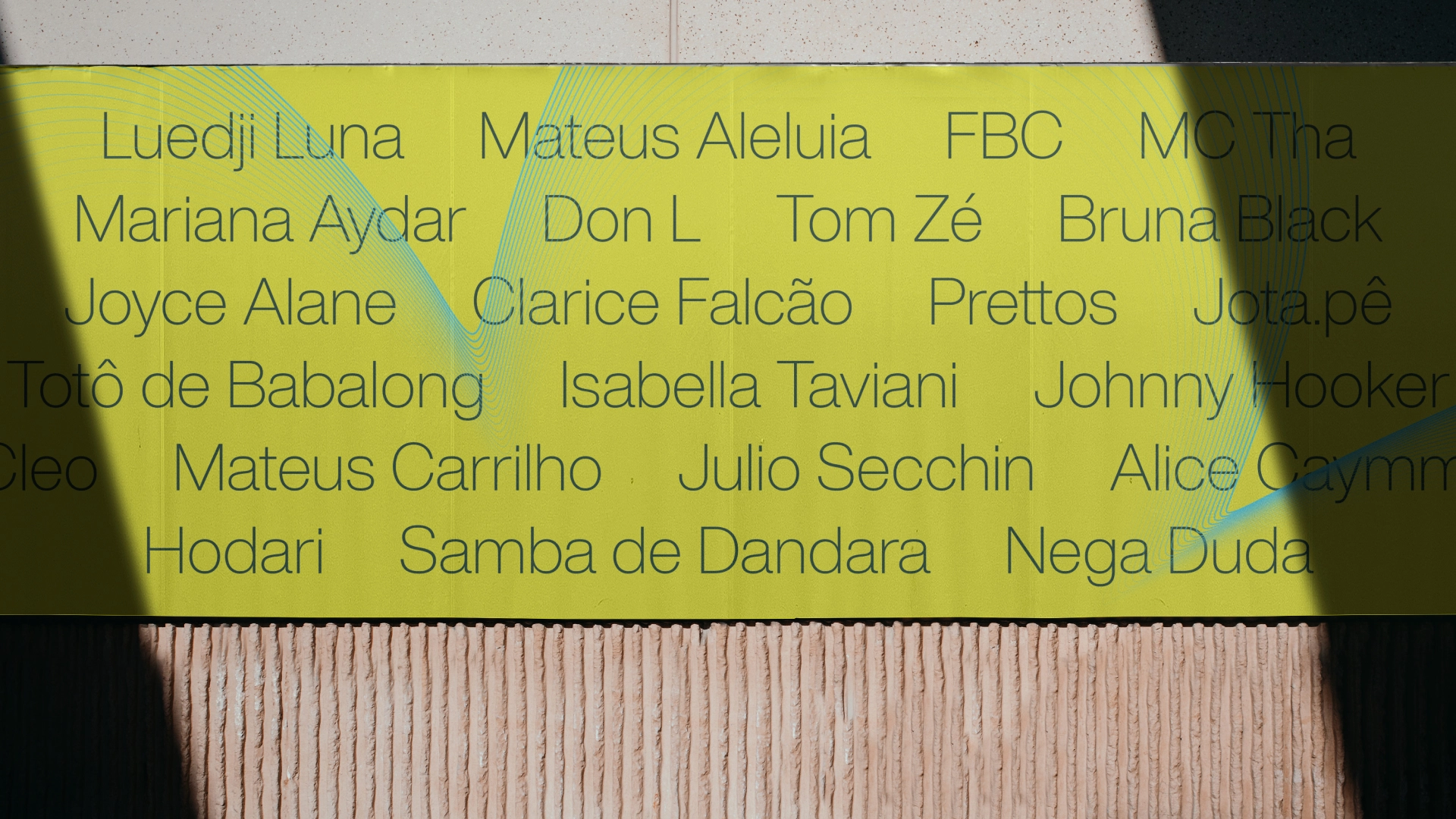
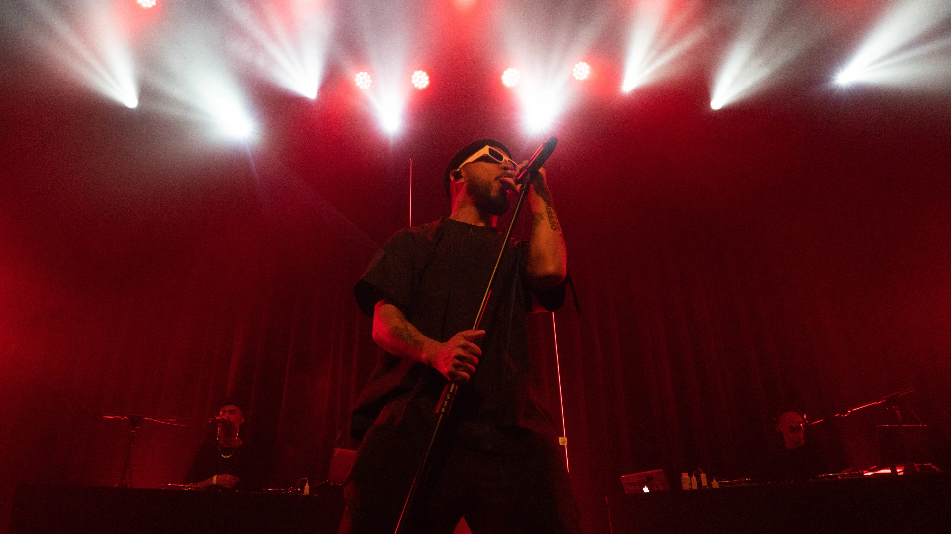
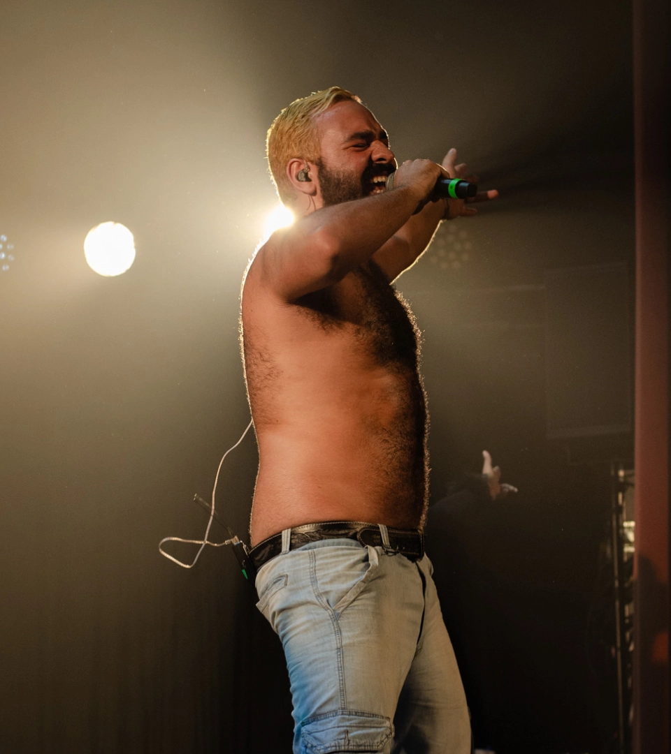
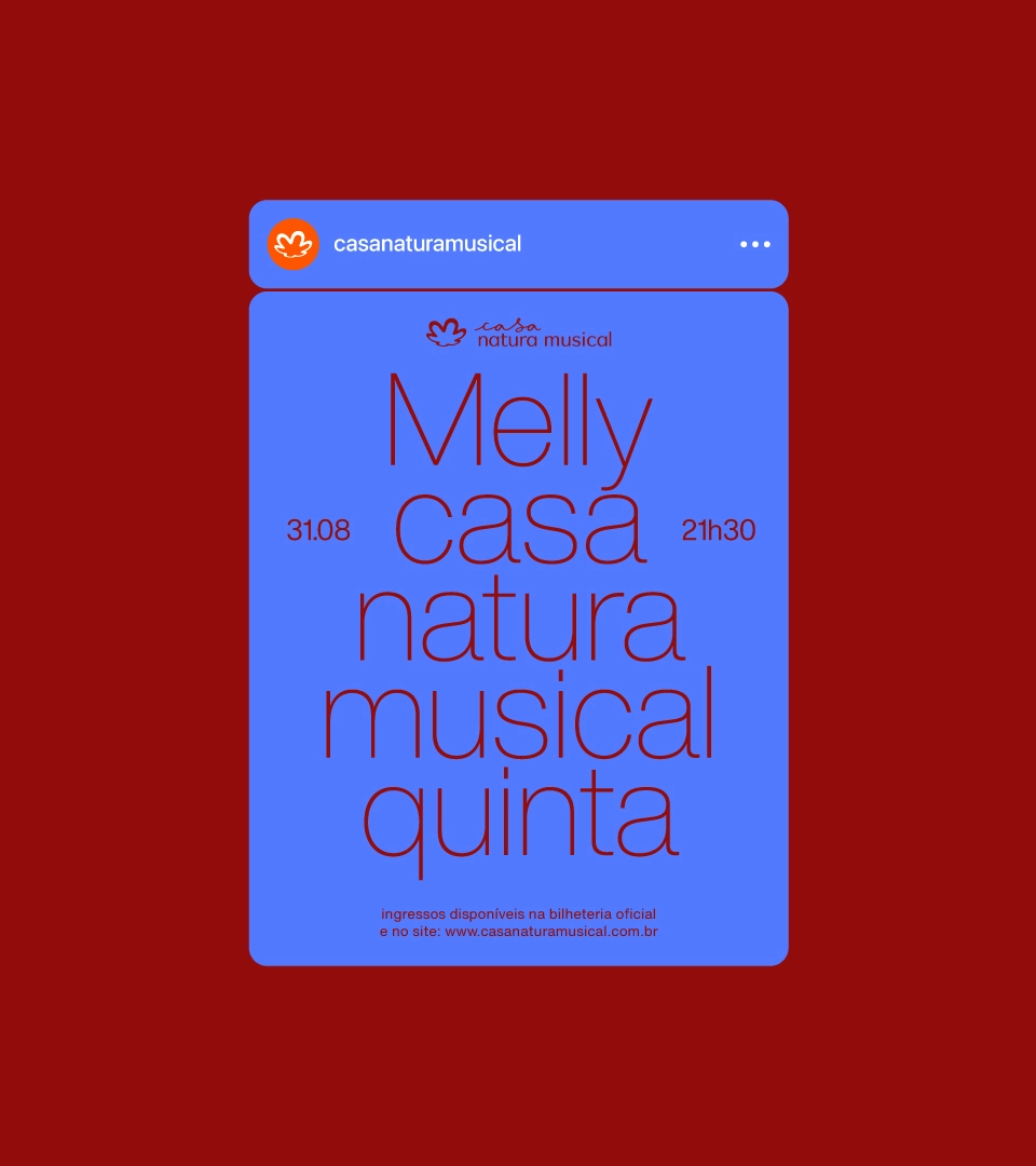
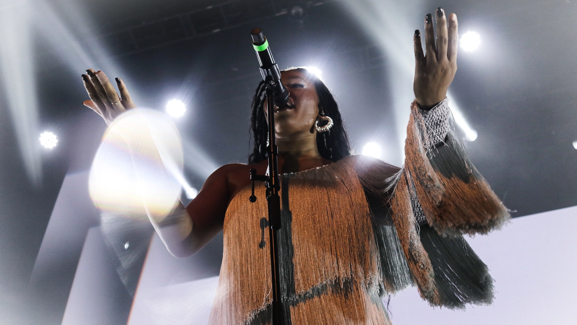
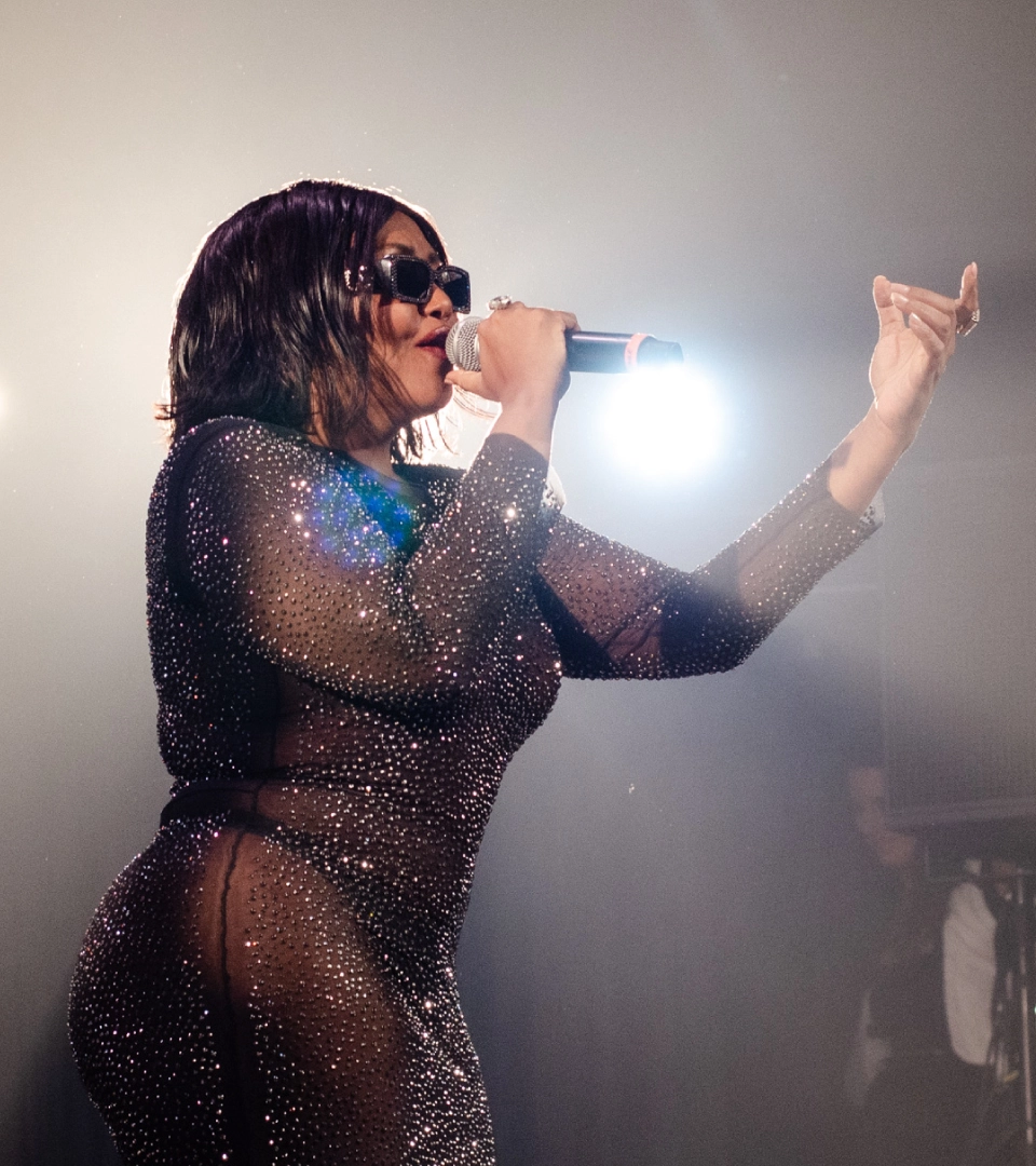
→ Natura Musical was born in 2005 to take on the challenge of strengthening national contemporary cultural production, helping music find new ways to spread, and with artists increasingly connected with their audience. In addition to sponsoring projects, the platform also boosts the musical experience with Casa Natura Musical – which opened in 2017 – to make the public-music connection increasingly rich, meaningful, and close to Brazilian culture, diversity, and sustainability.
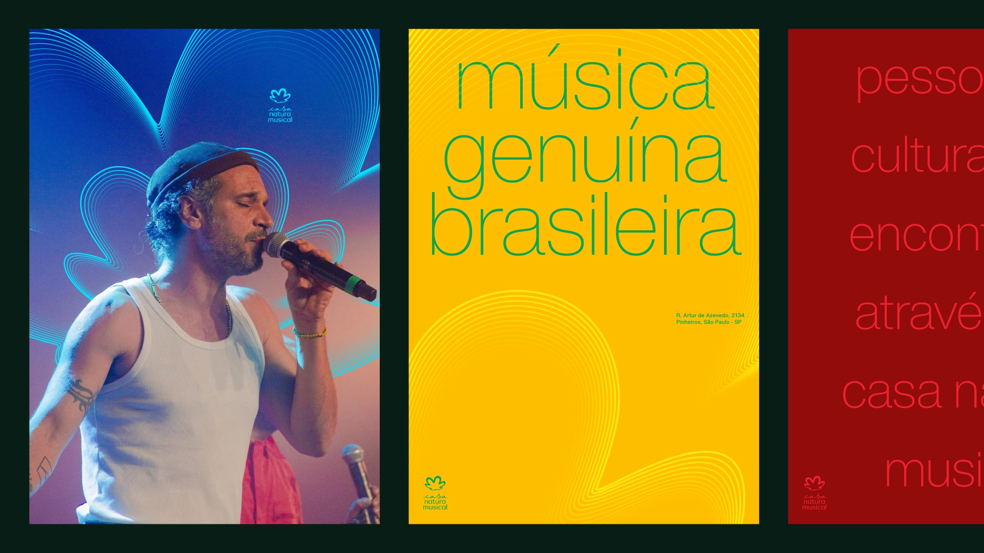
Papapanapa was invited by Natura to develop an integrated visual identity system for the two fronts of the program: Natura Musical and Casa Natura Musical.
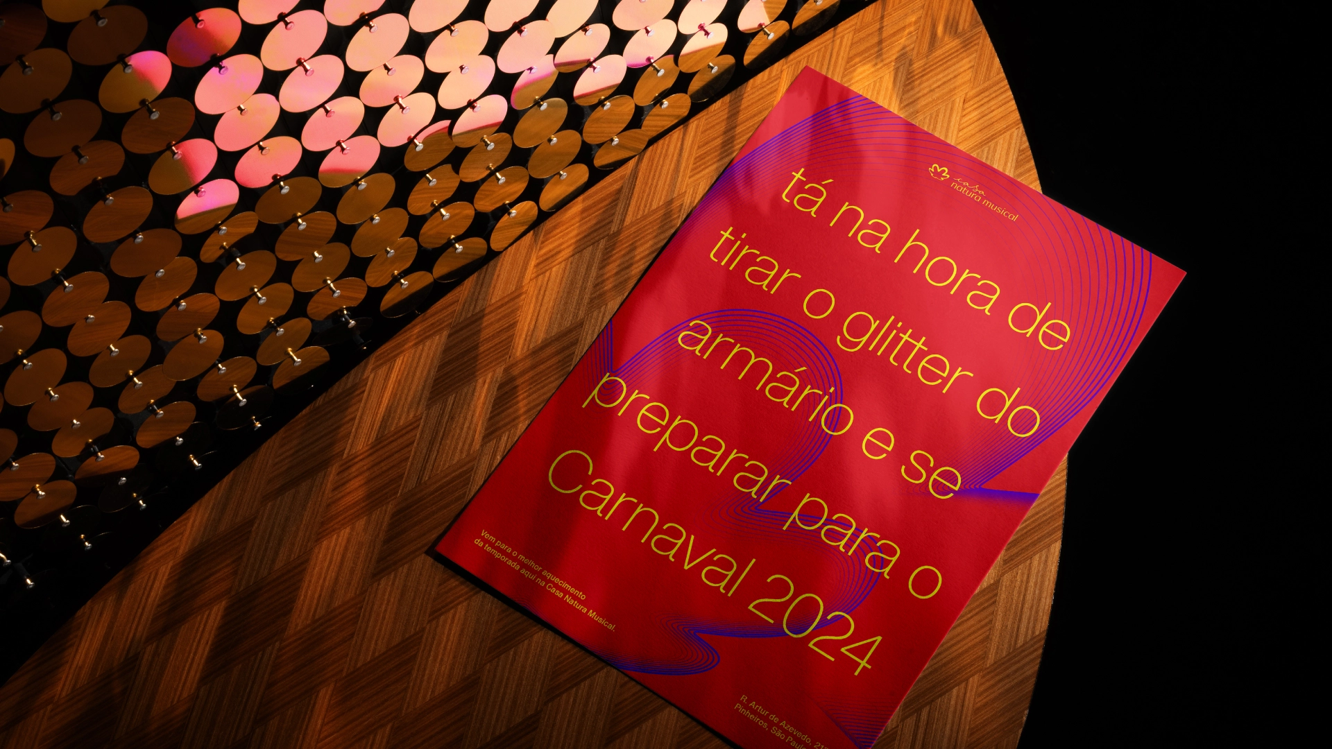
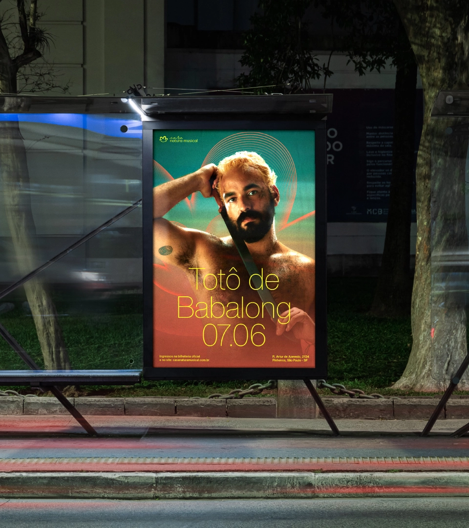
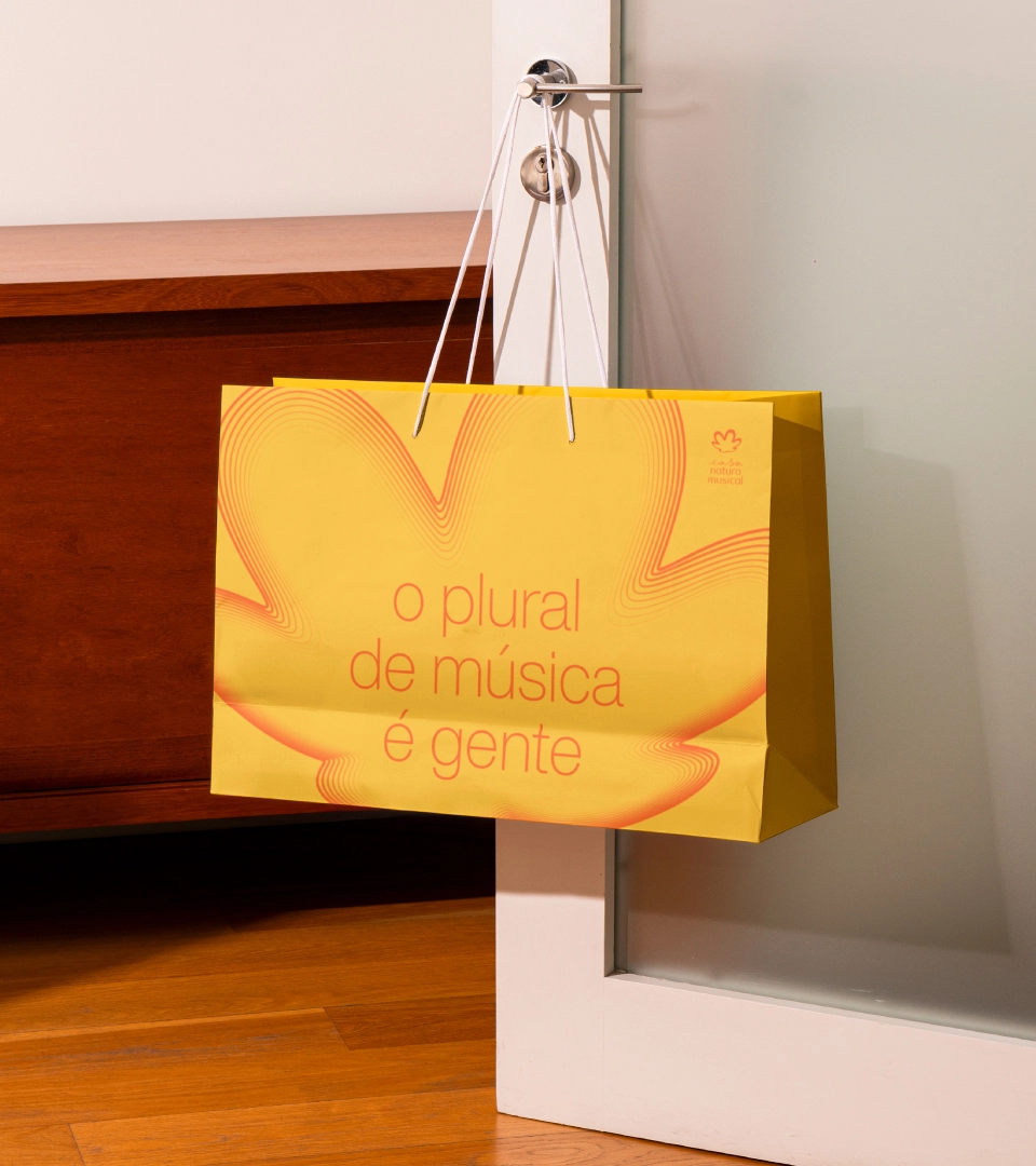
Our process had as its starting point the reverberated Natura symbol, developed by Agência África for the "E Se? (What if?)" movement. Seeking a connection with the brand's institutional universe, we saw the opportunity to explore new behaviors on the musical front: more connected to music and the program's mission.
Based on this discovery, we incorporated lines into the symbol that pulse in constant movement, reflecting the sound plurality of the artists involved and the energy present in each moment we find ourselves in the music.