

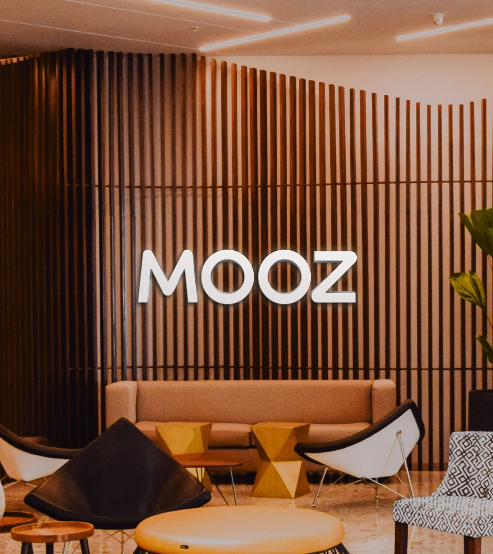
MOOZ
Logo, Visual Identity


→ 2023
Client: Grupo Boticário
Agency: Papanapa
Role: Graphic Design, Motion Graphics
Team: Cassia Freire, Gustavo Garcia, Lucas Rodrigues
Positioning: Renata Monteiro (Criatexto)
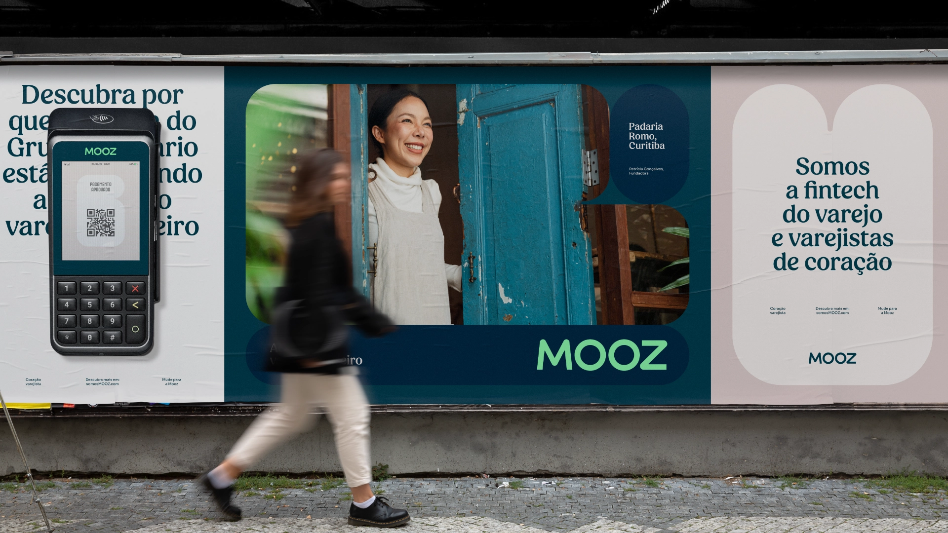
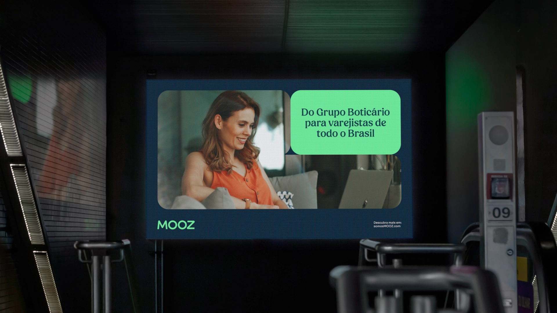
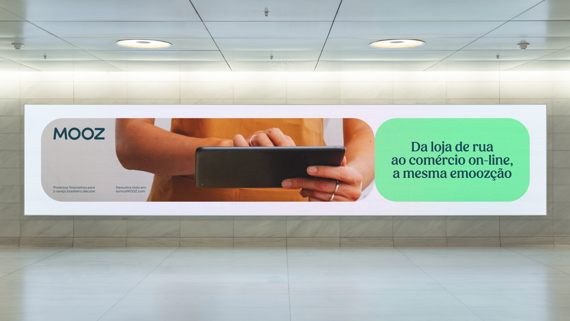
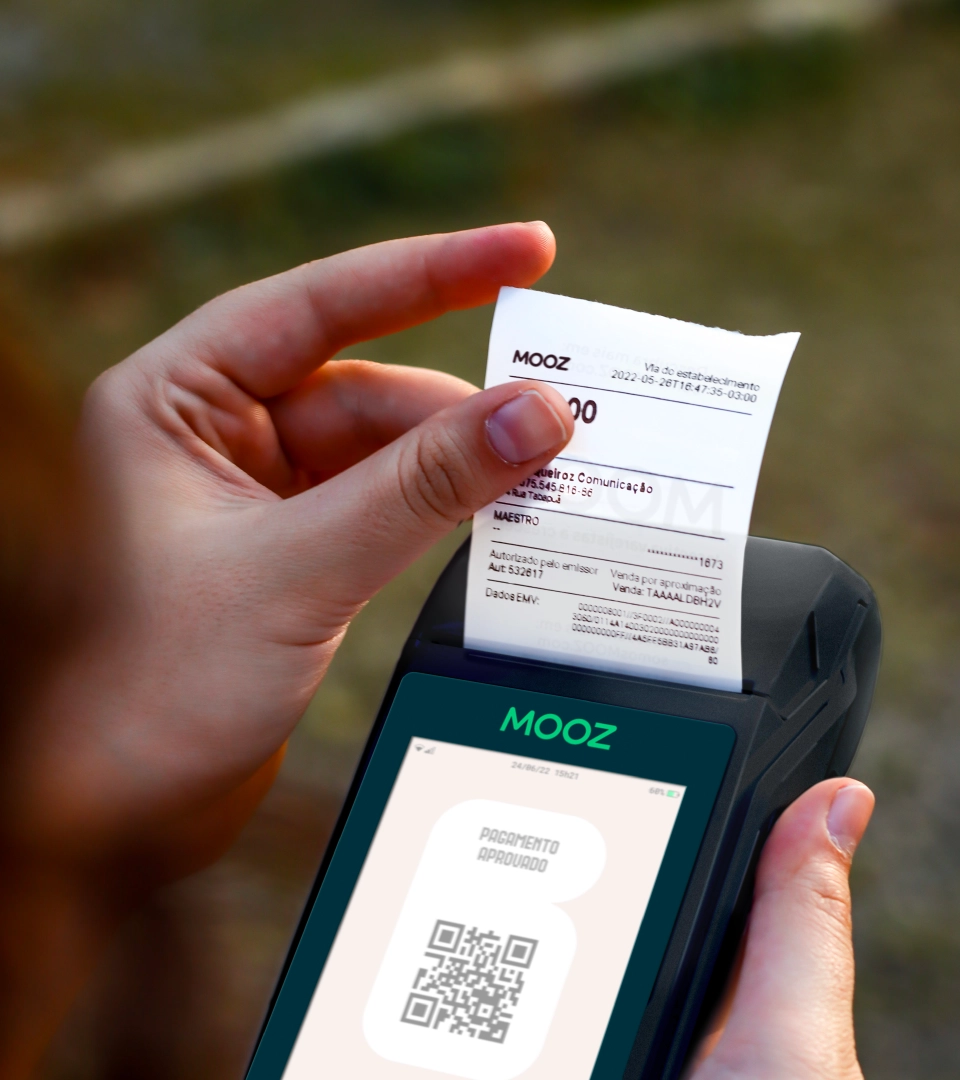
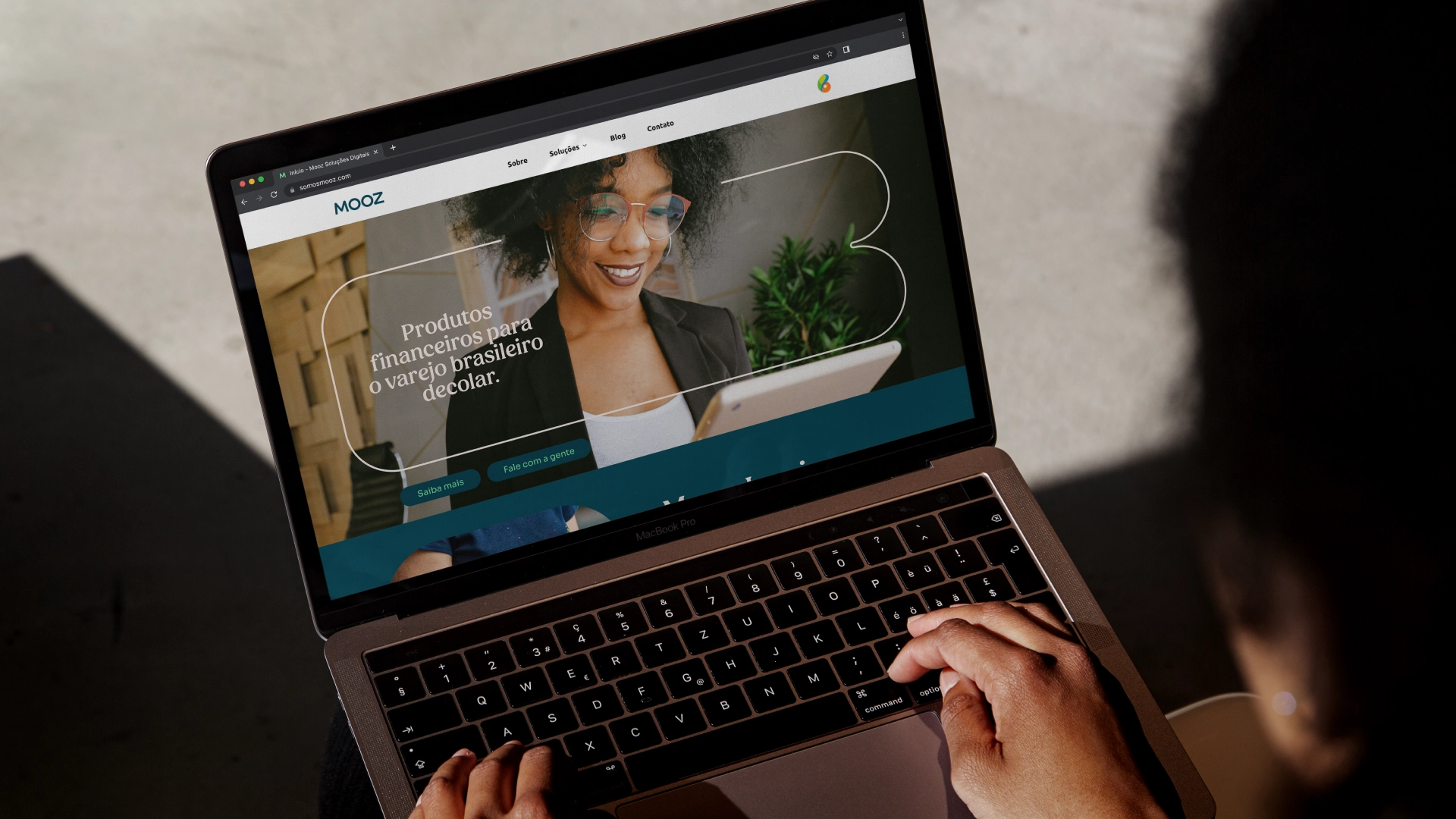
→ MOOZ is a brand of the Retail Tech unit of Grupo Boticário. Through integrated financial solutions, the brand served exclusively to franchises and resellers of Grupo Boticário, in 2023, it launches itself to the market.
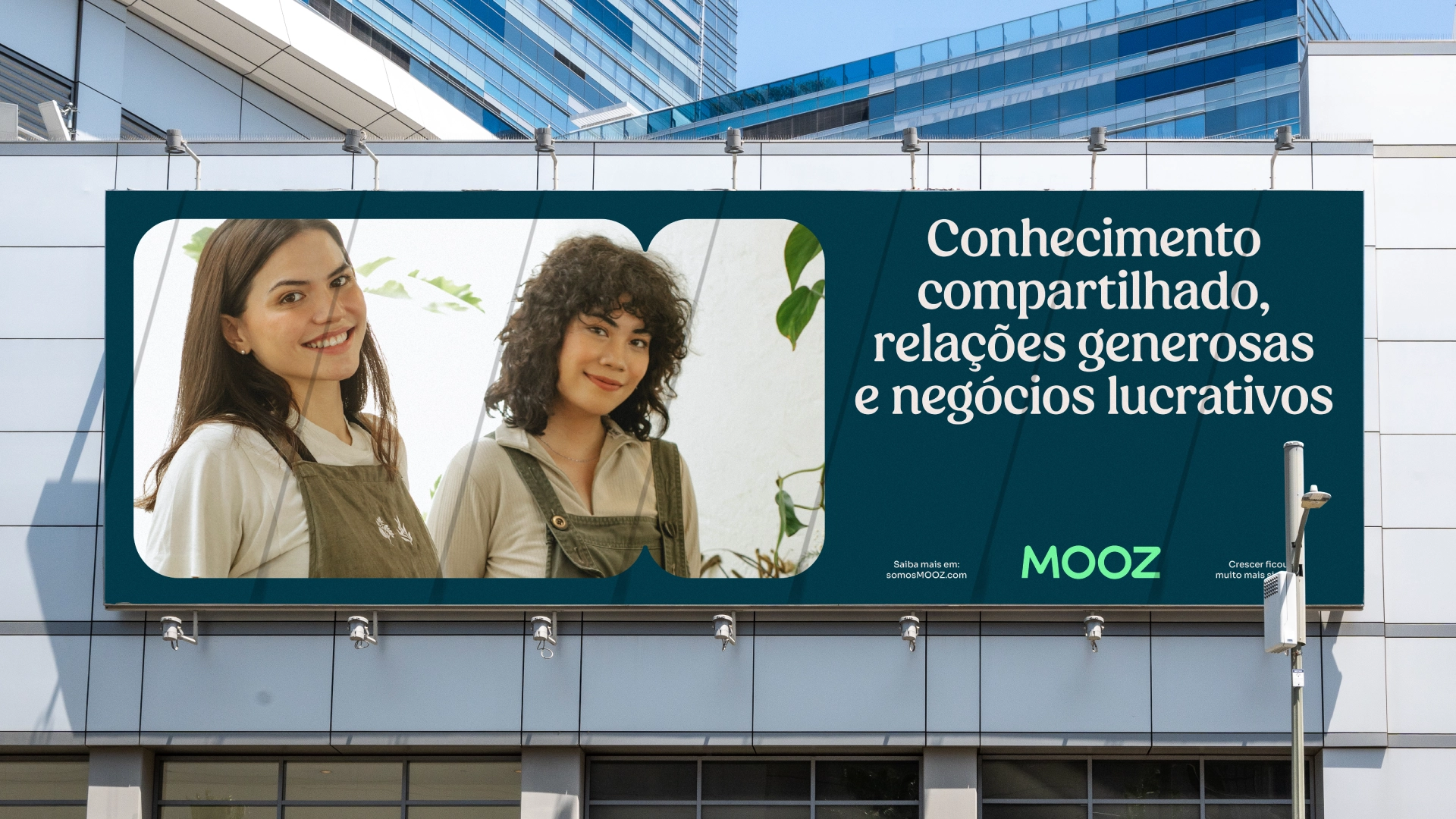
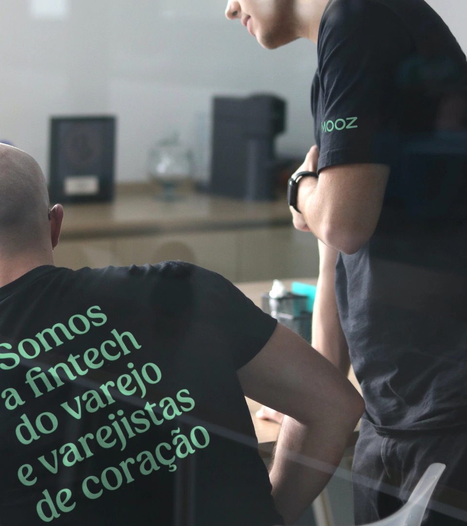
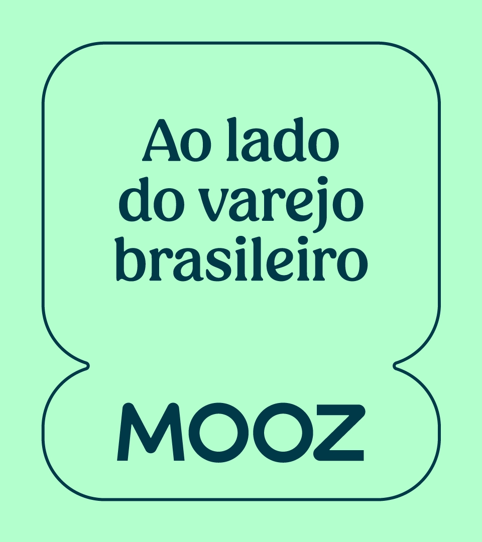
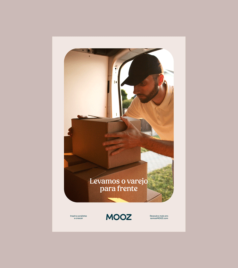
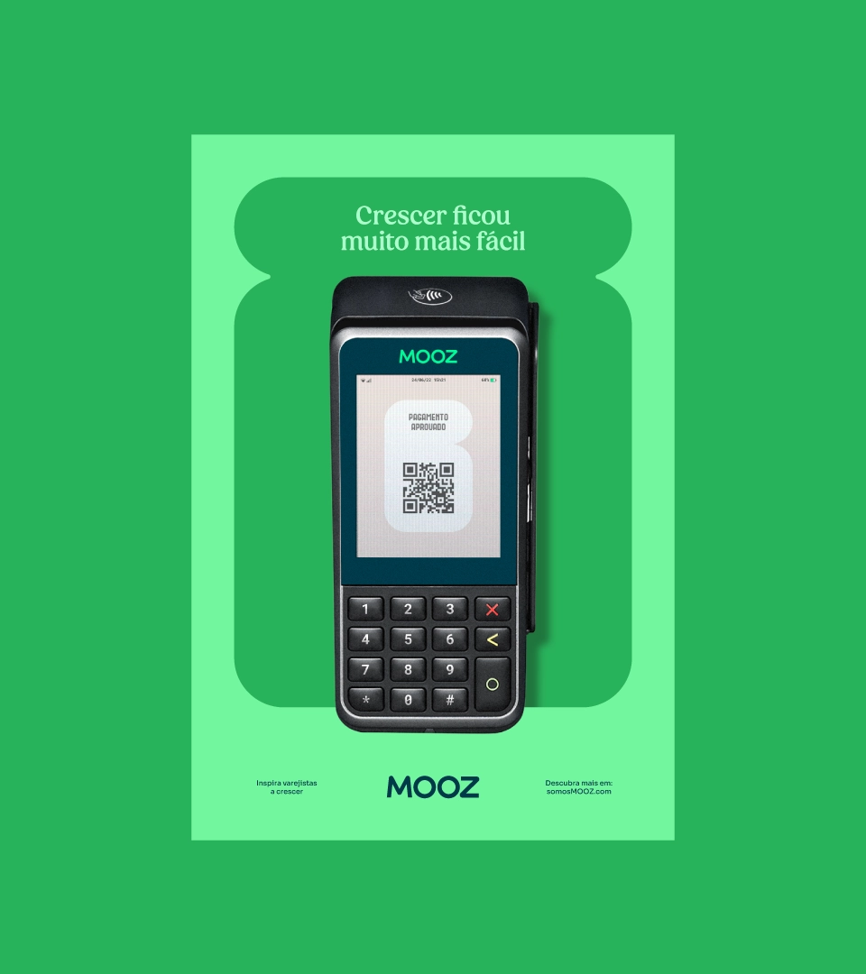
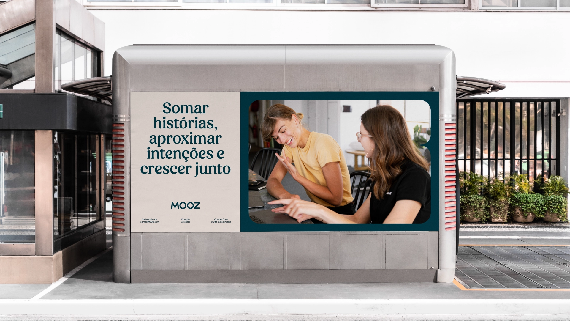
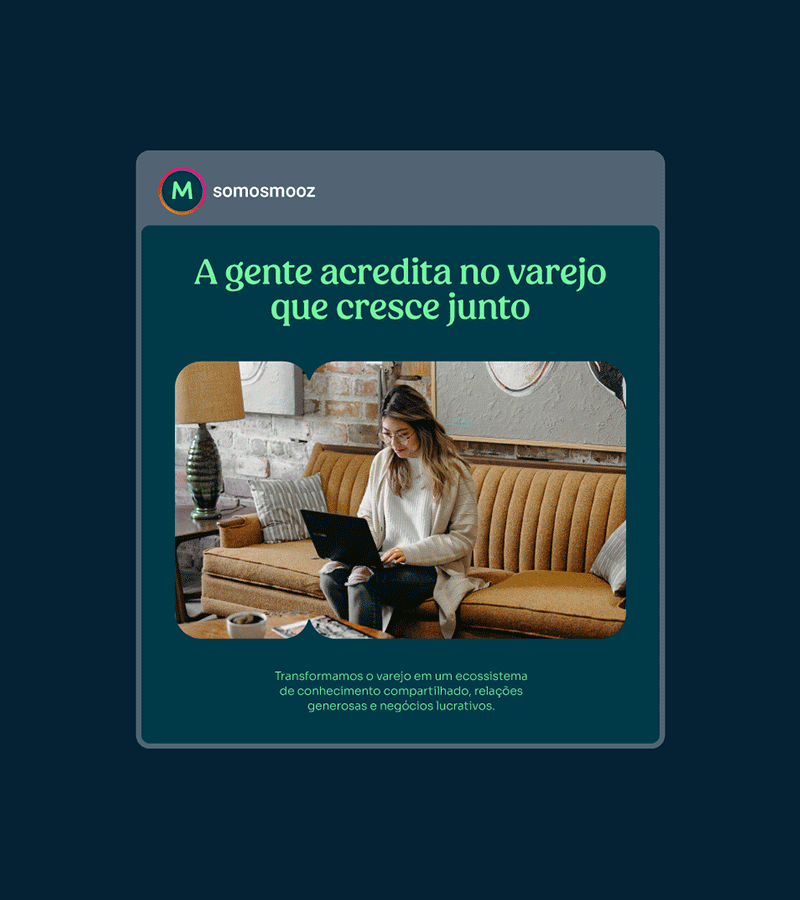
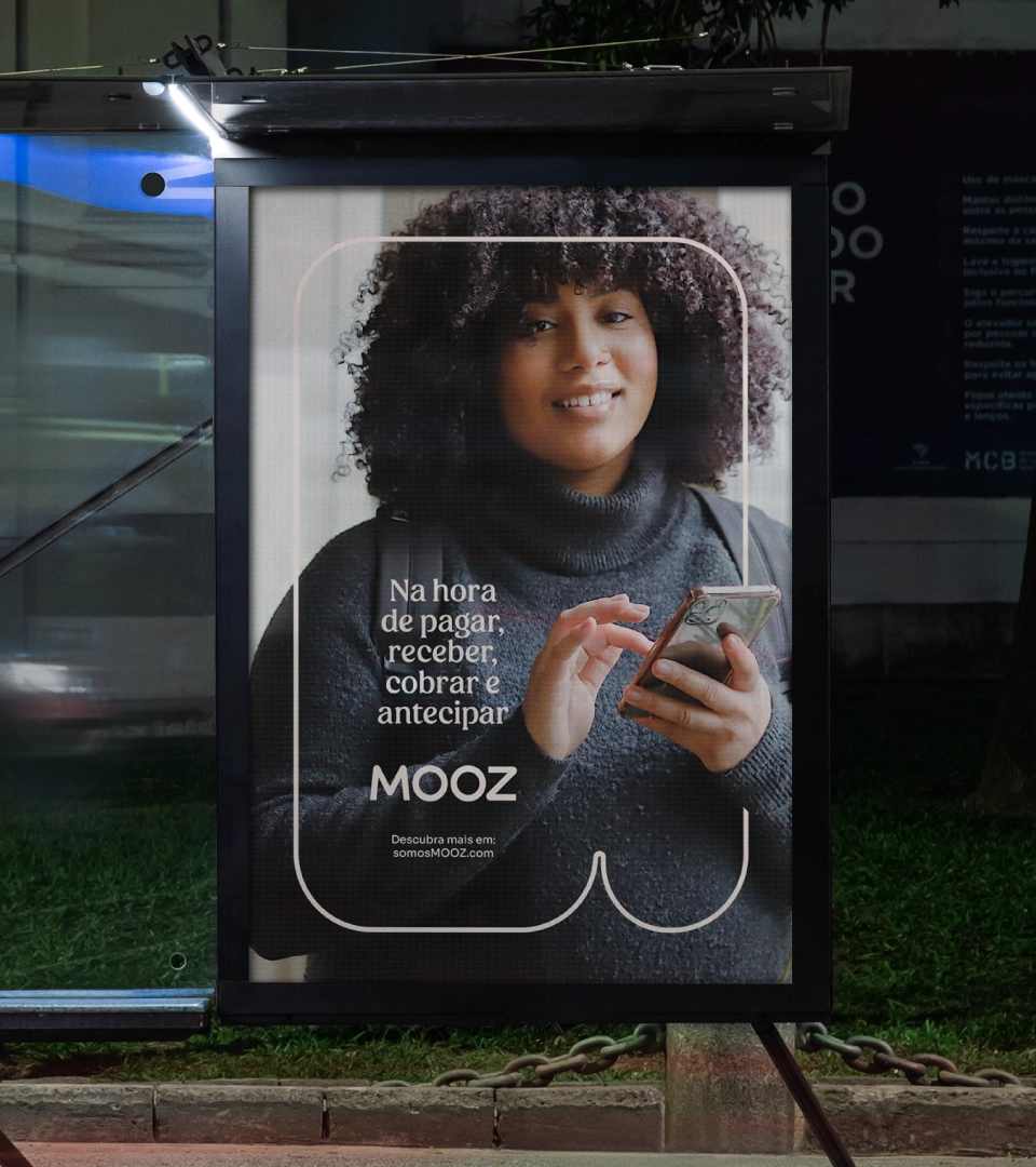
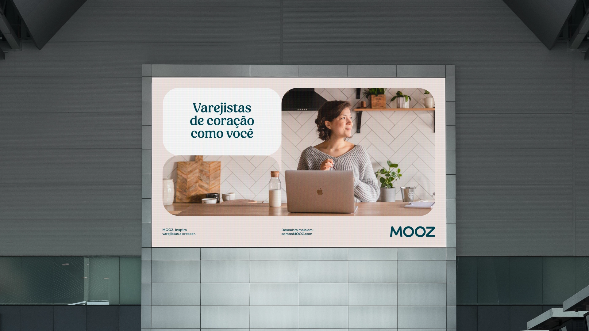
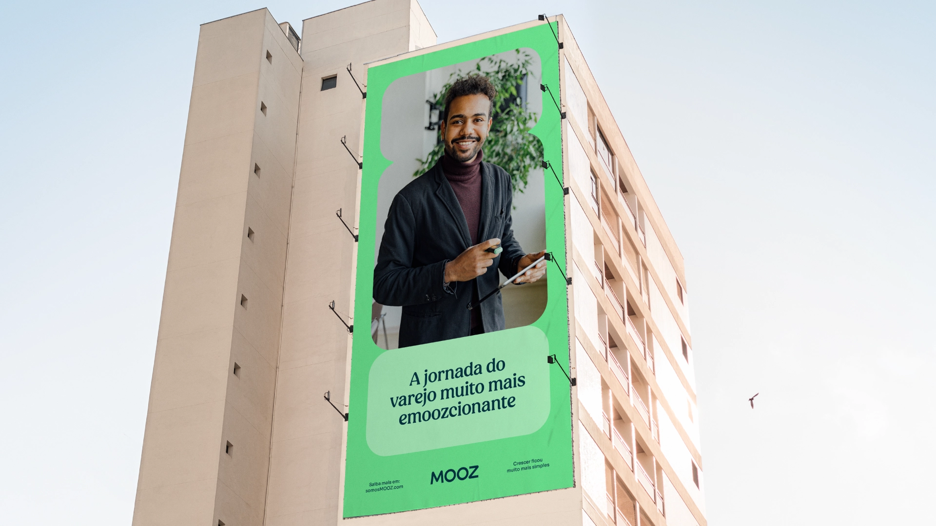
If offering integrated financial solutions is very good, adding knowledge and passion for retail to this delivery is even better. Therefore, we defined their team as – Retailers at heart – and created a dynamic and emotional narrative of those who ‘encourage retailers to grow.’
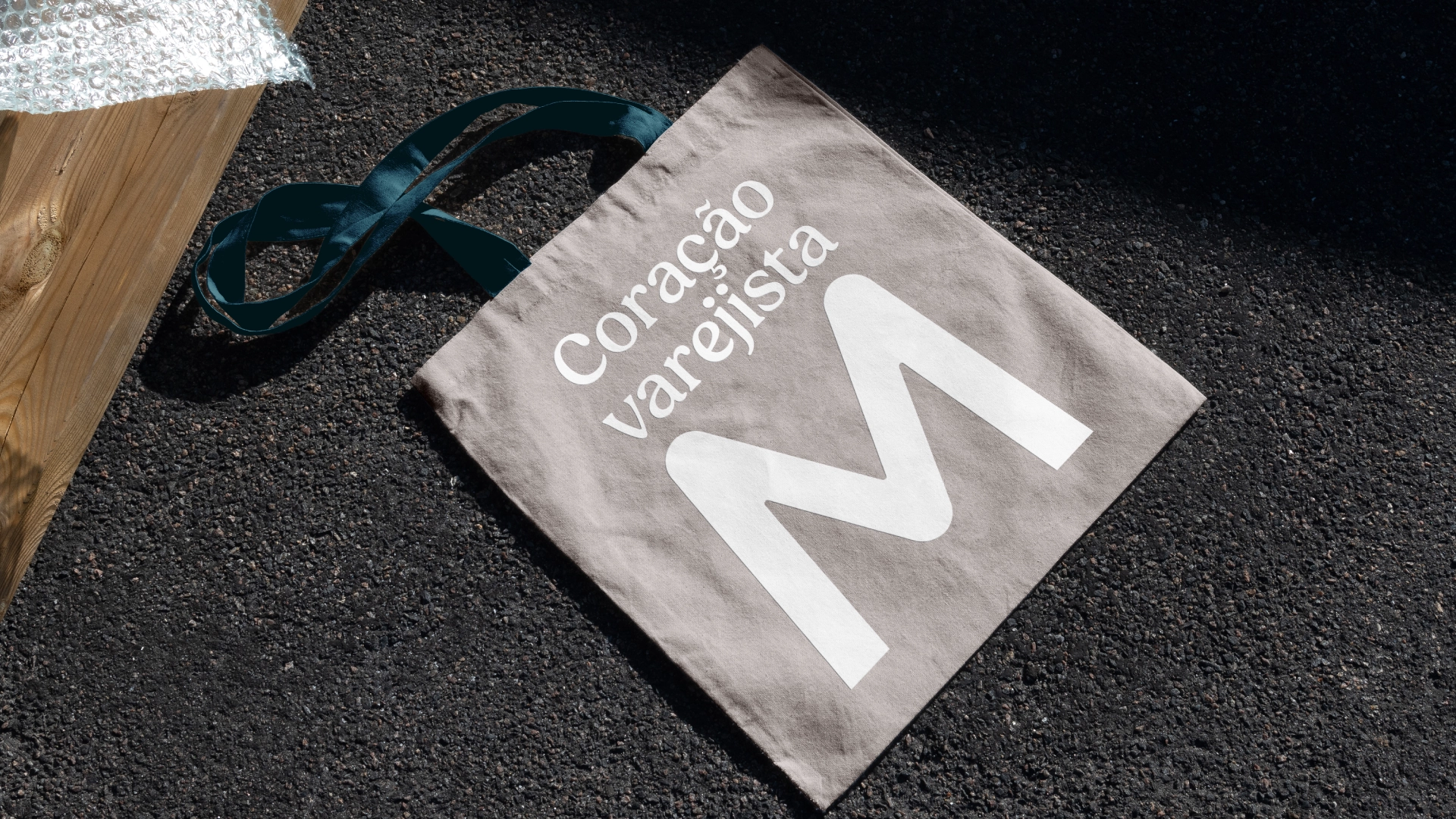
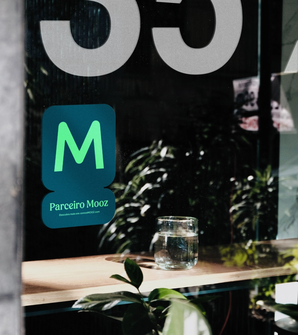
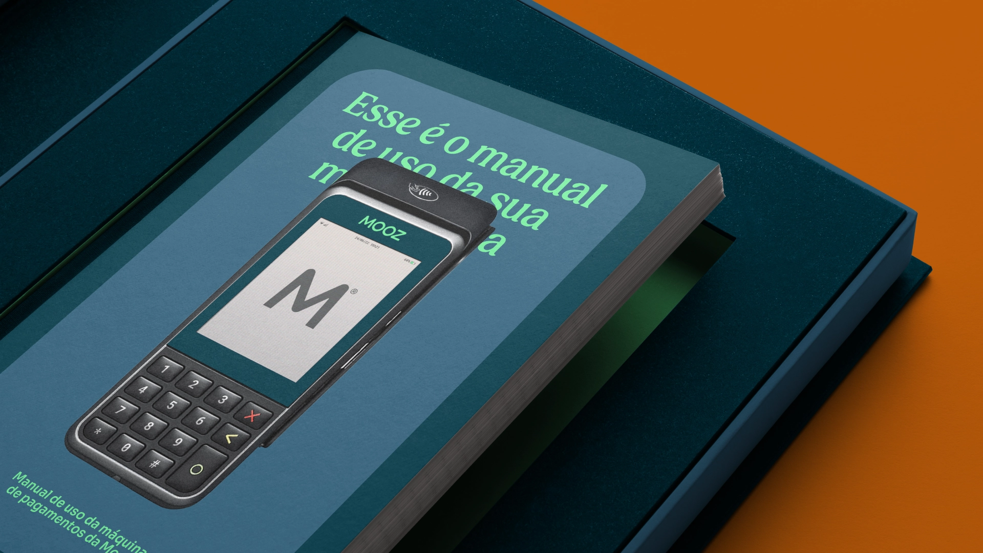
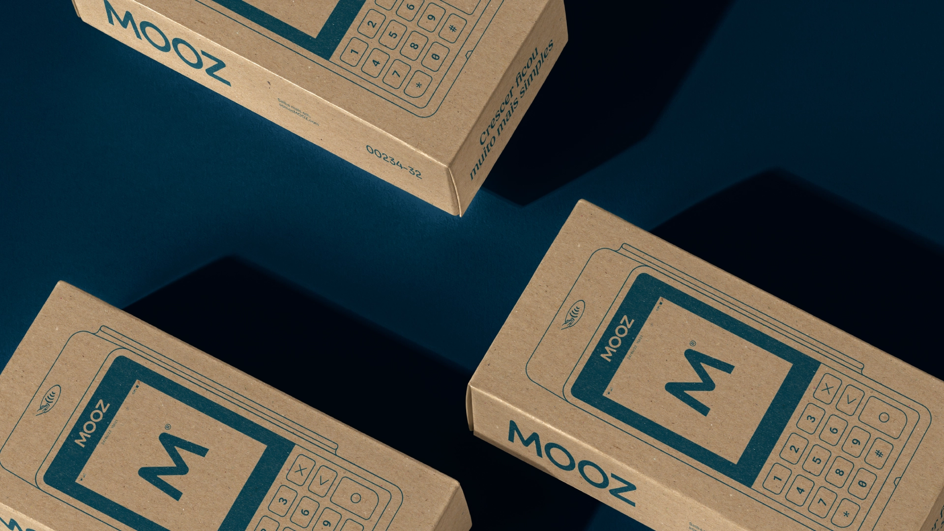
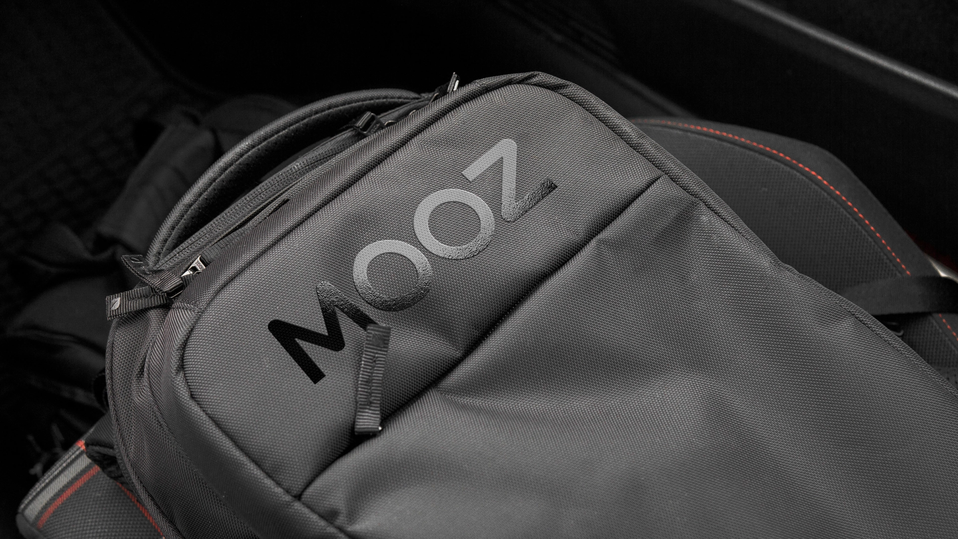
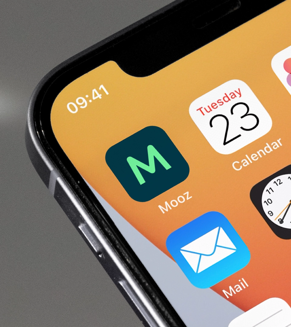
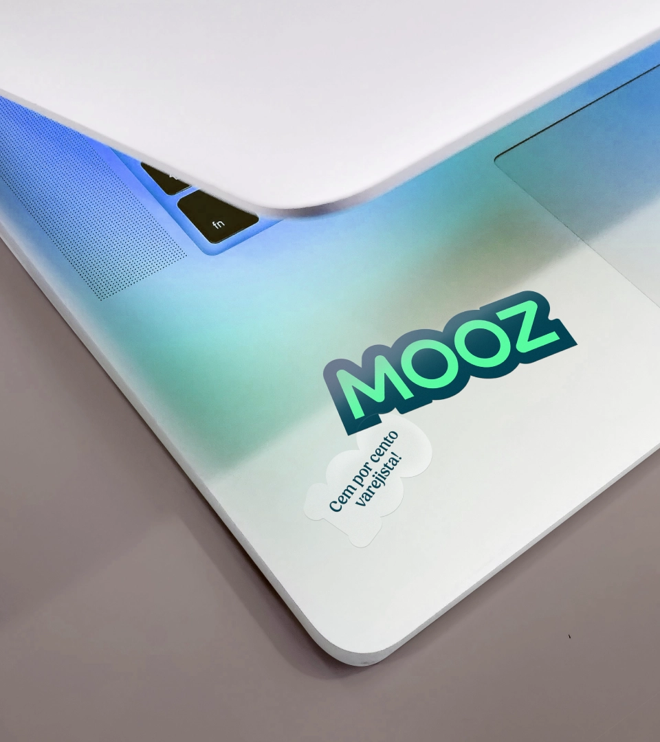
The existing logo, with thin lines, rigid structure, and sharp corners, became disconnected from the new positioning and no longer represented the brand’s essence. The new design – more fluid and uncomplicated – connects directly to MOOZ’s values and objectives. At the center of the visual language, a modular and restless system of rounded shapes, affectionately called Gomooz, reflects the ecosystem of constant collaboration and transformation.
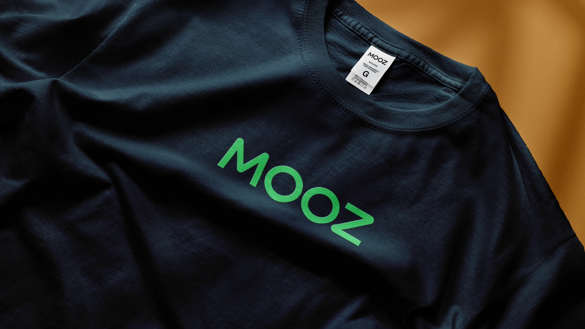
The new color palette, combining shades of green and vibrant orange, balances a commitment to doing better and the human side of retail. In the verbal identity it brings, the energetic and inspiring tone of voice motivates and invites us to transform. Its essence is reinforced and visually represented through typography with a welcoming personality.