

Manual do Mundo
Logo, Visual Identity


→ 2021
Client: Manual do Mundo
Agency: Ana Couto
Role: Graphic Design, Illustration, Motion Graphics
Team: Adilson Jr., Gabriel Carneiro, Gabriel Martoni, Danilo Cid, Filipe Ozelin, Isabella Herdy, Lucas Rodrigues
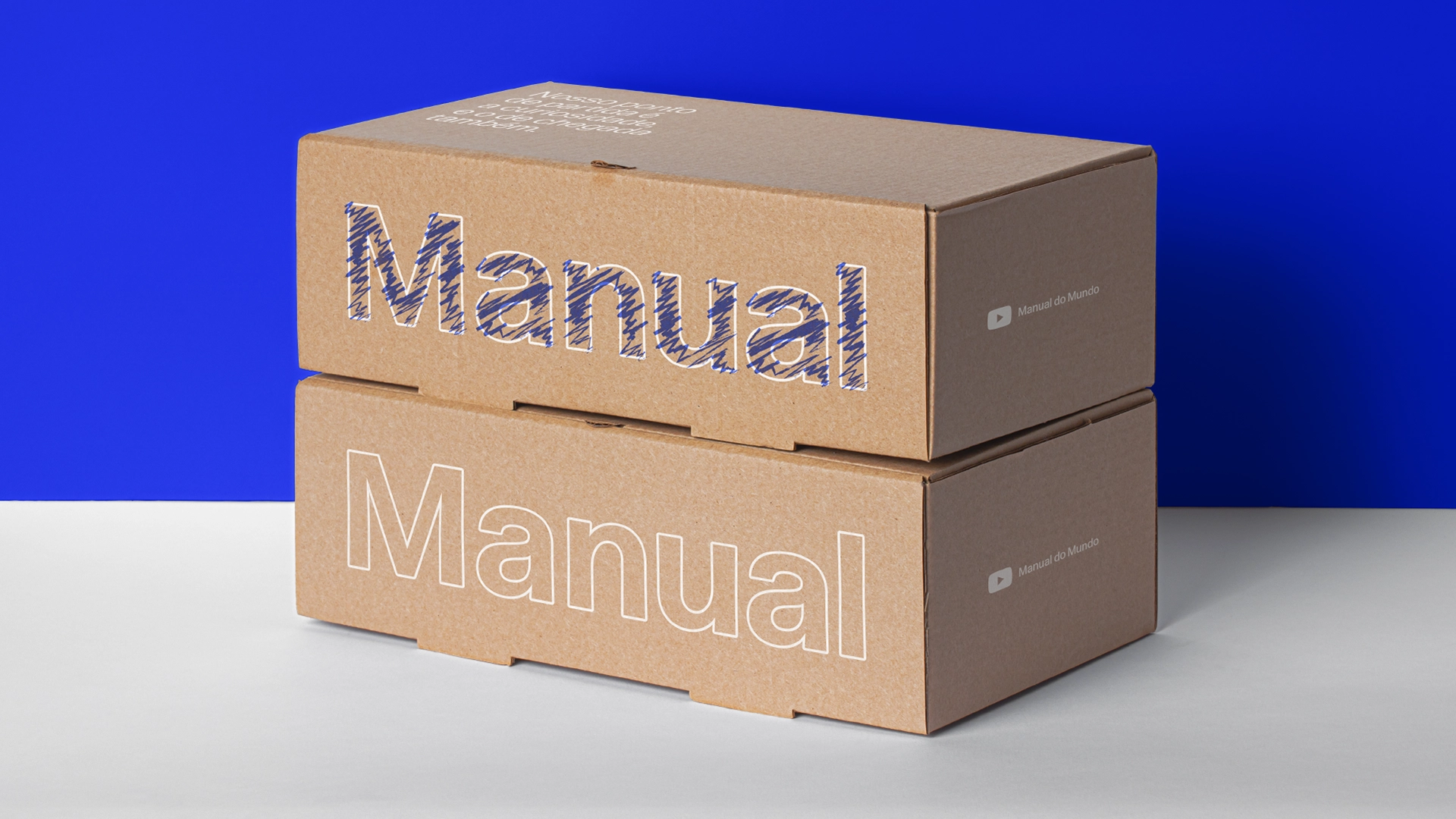
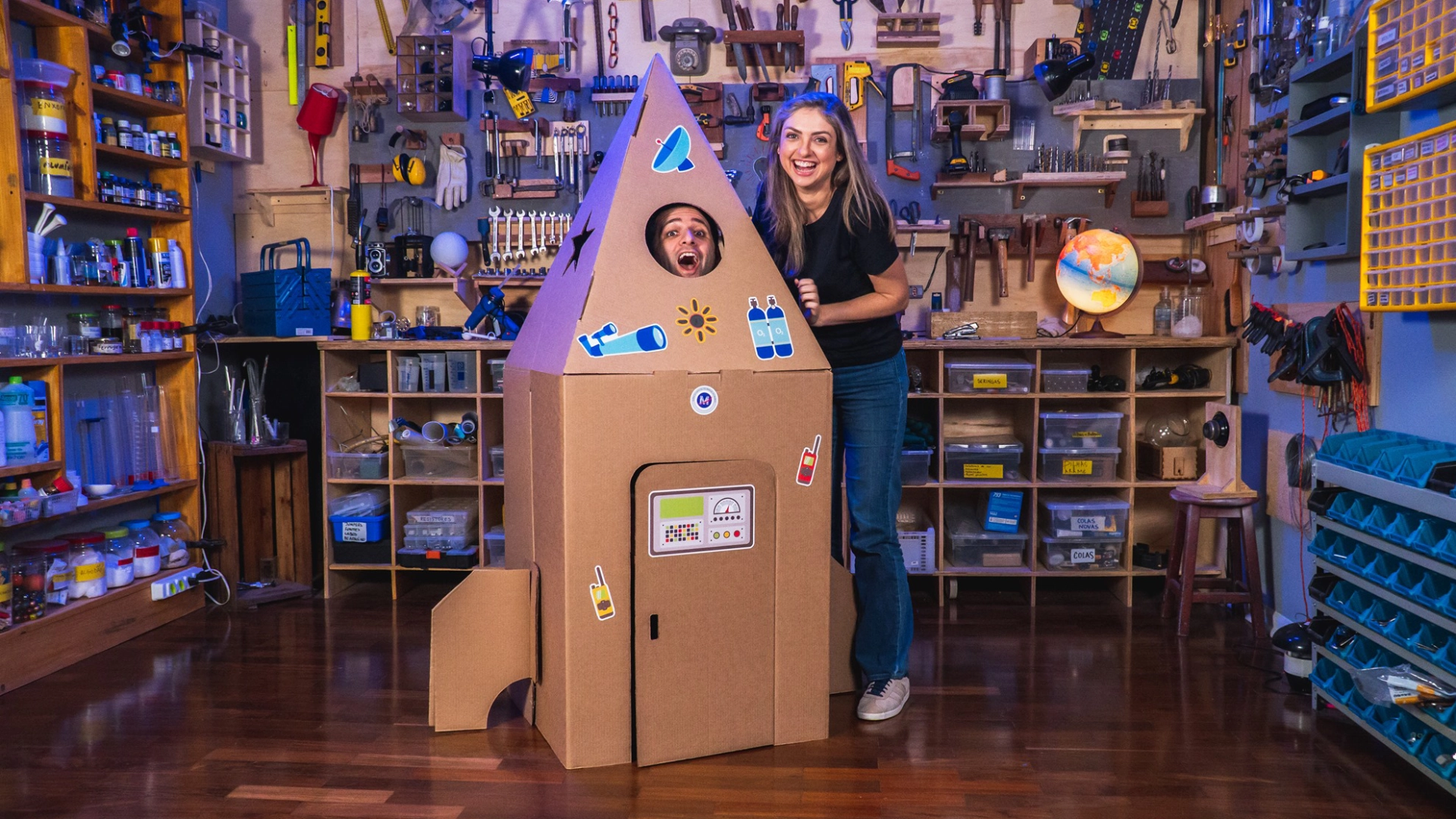
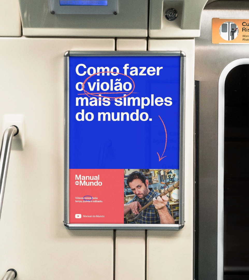
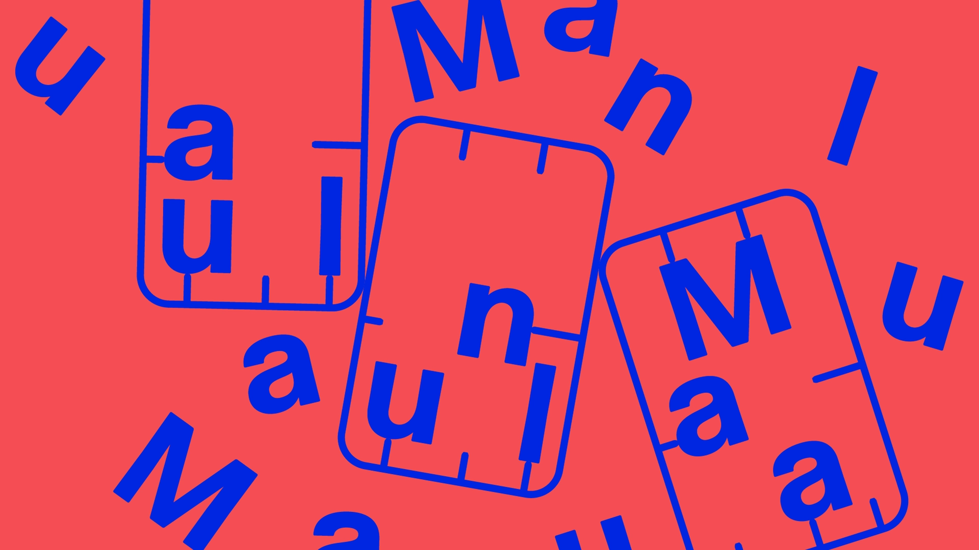
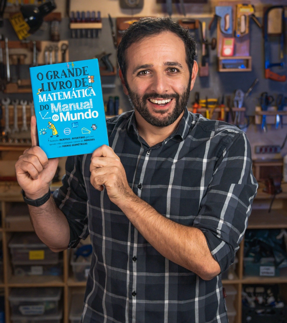
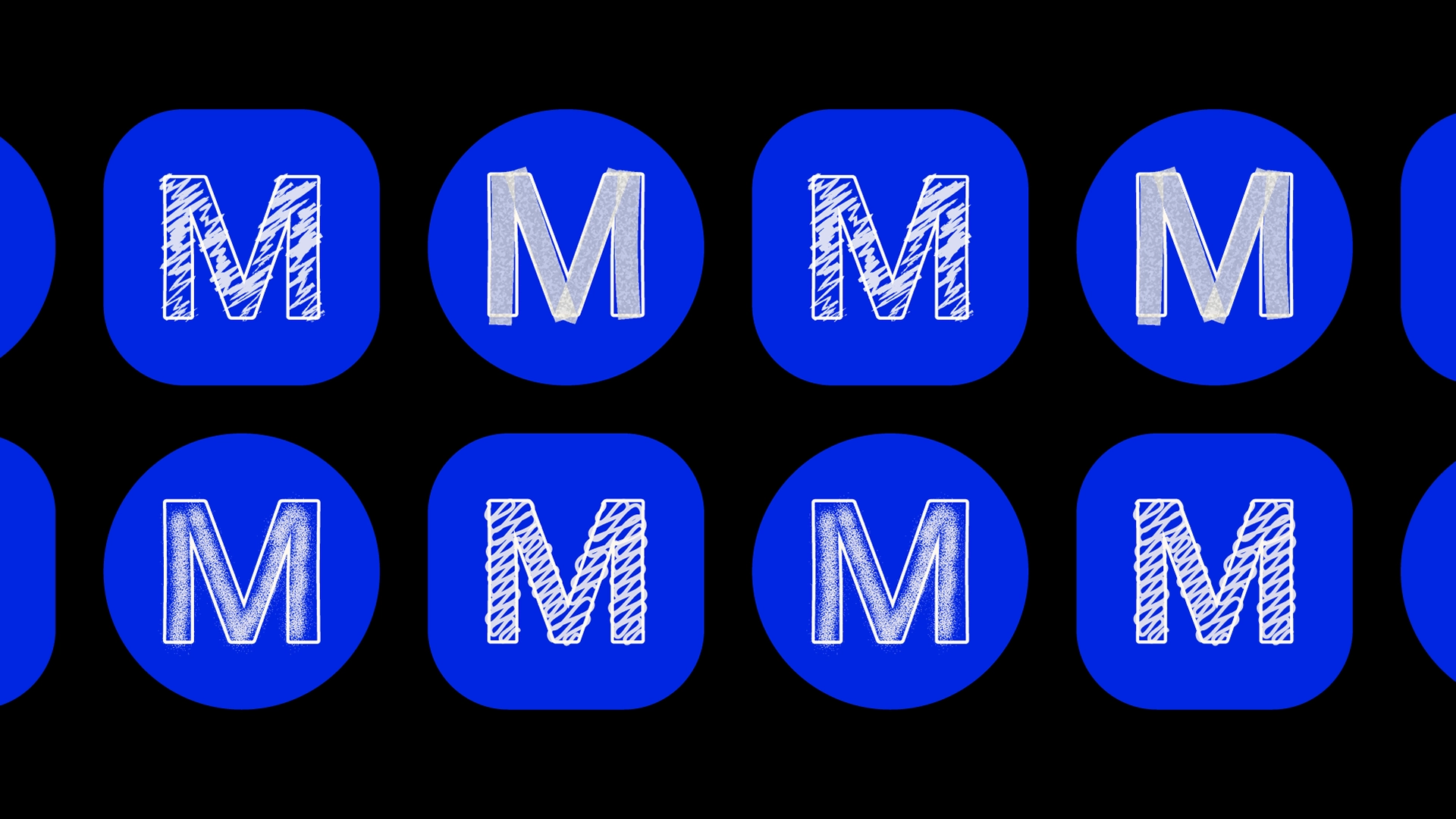
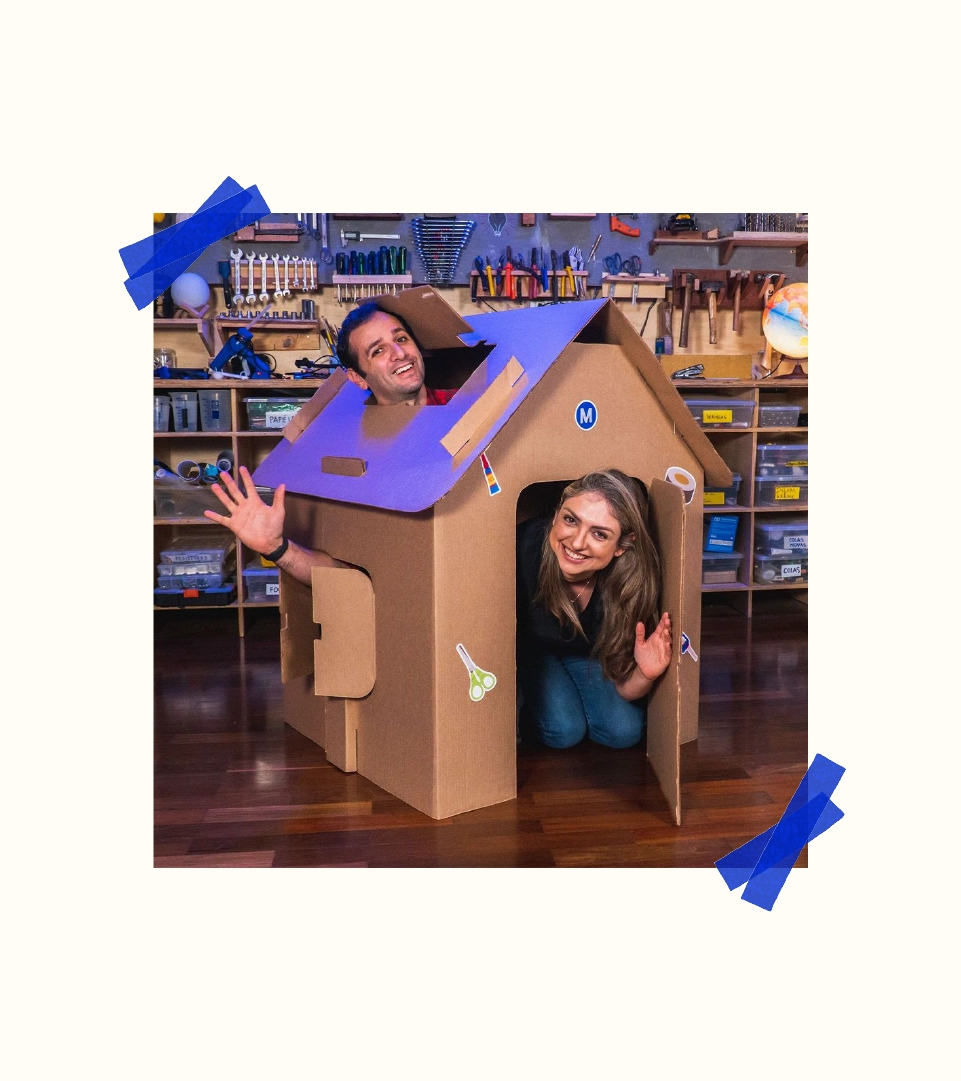
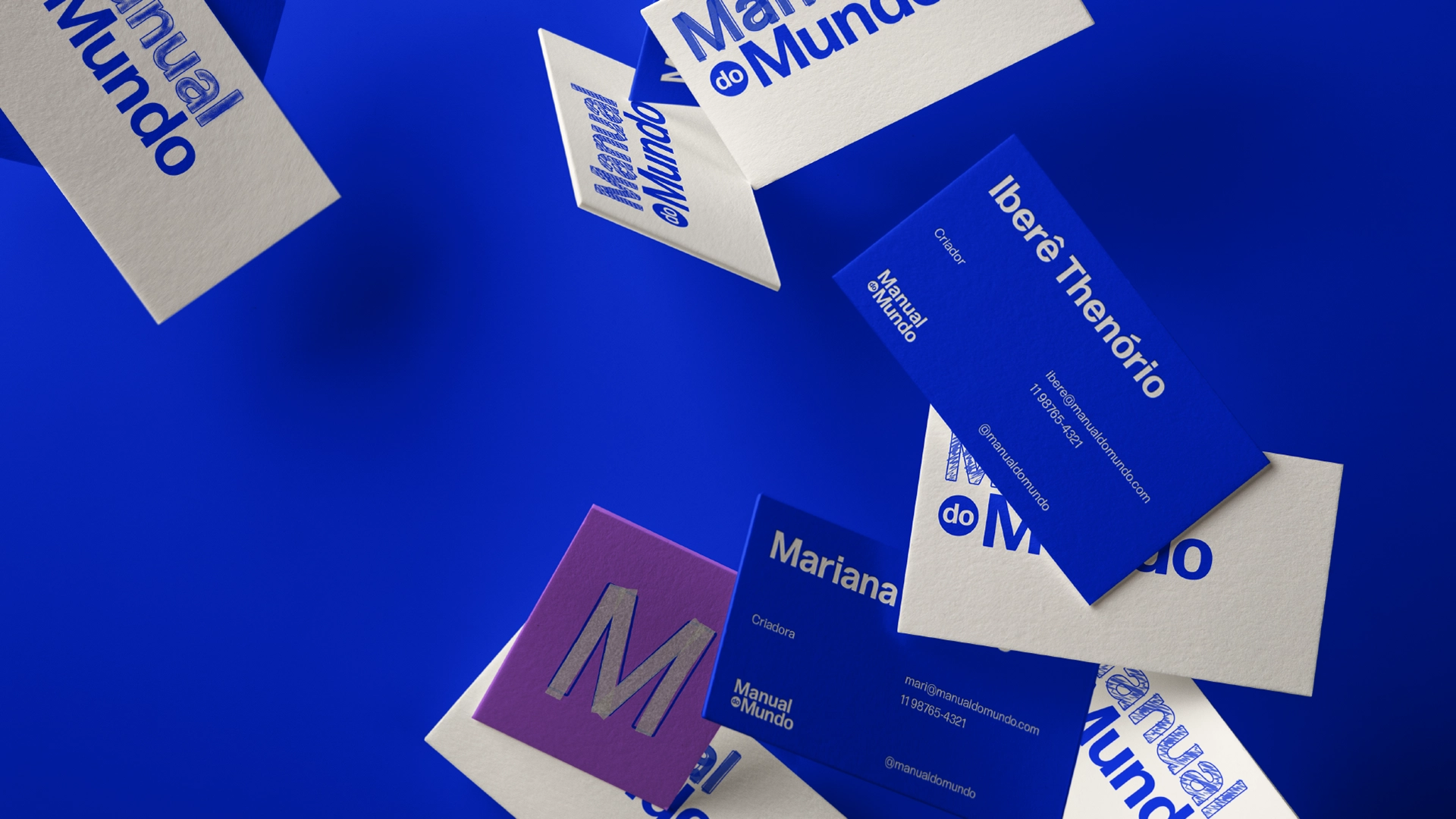
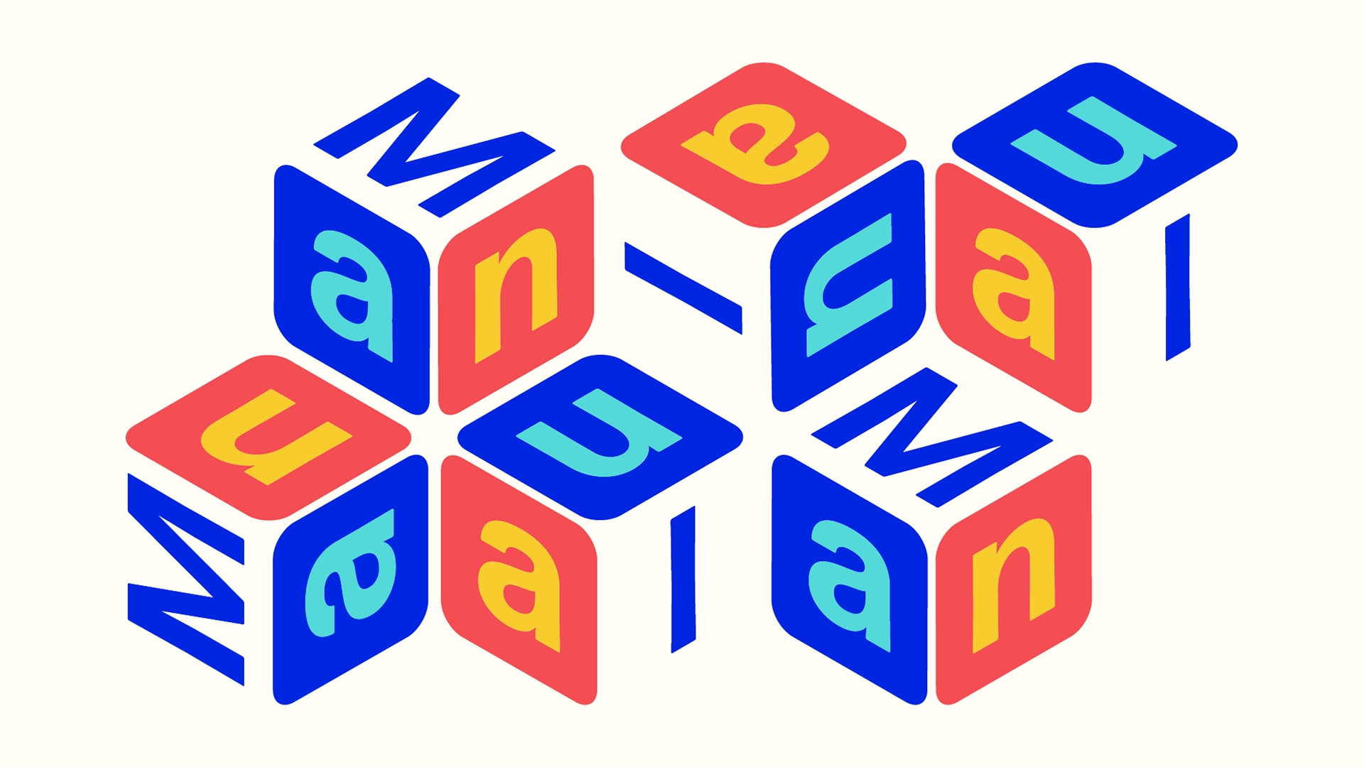
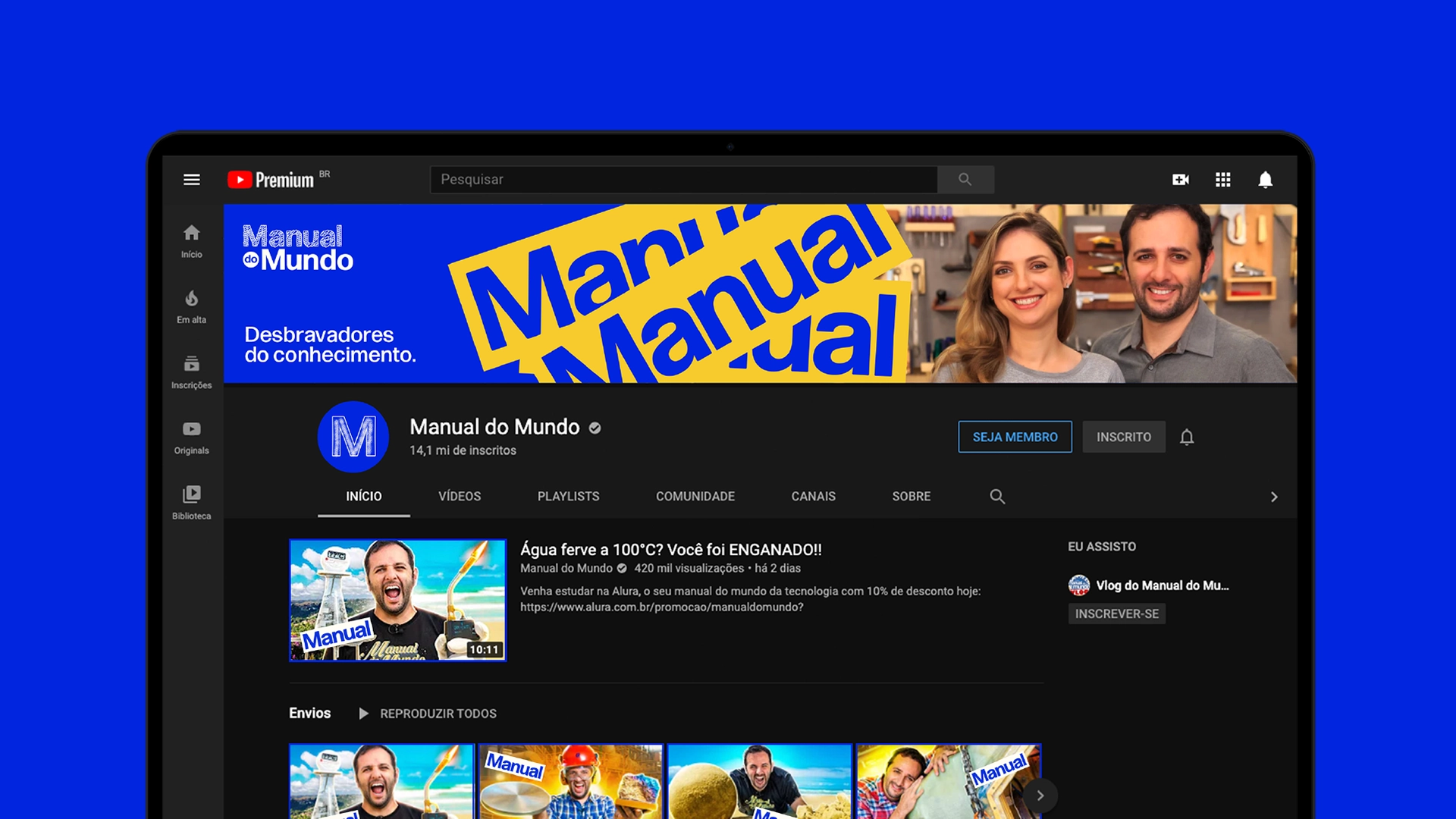
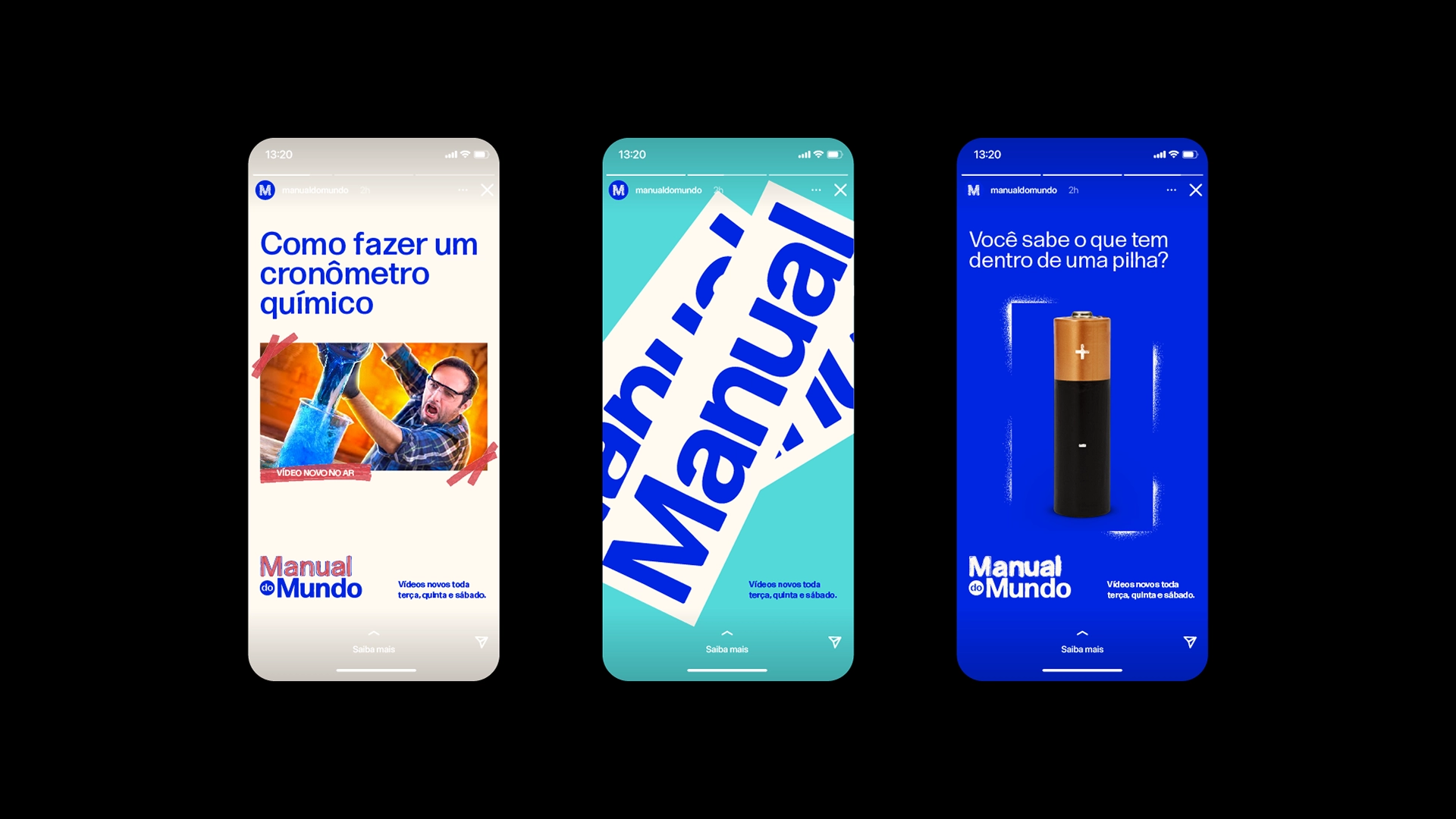
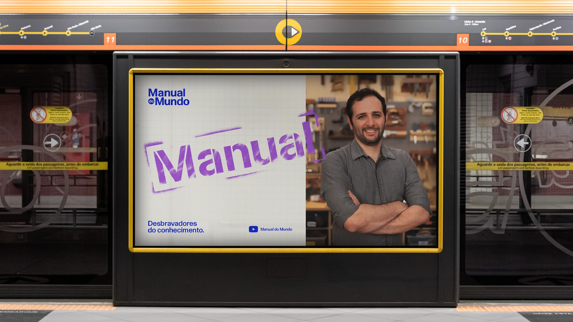
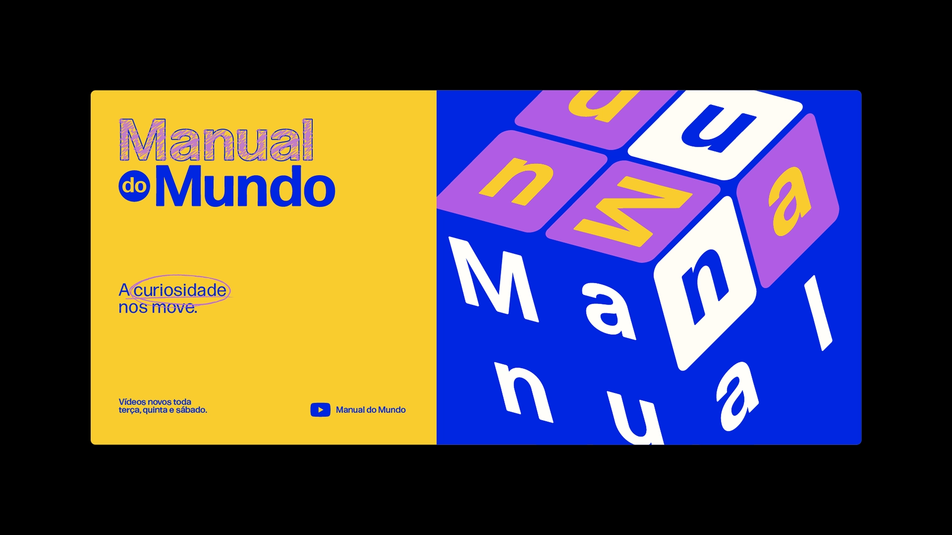
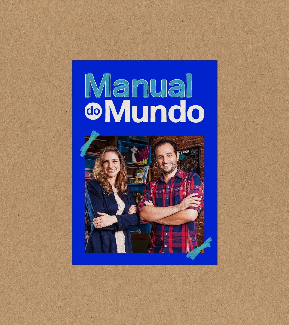
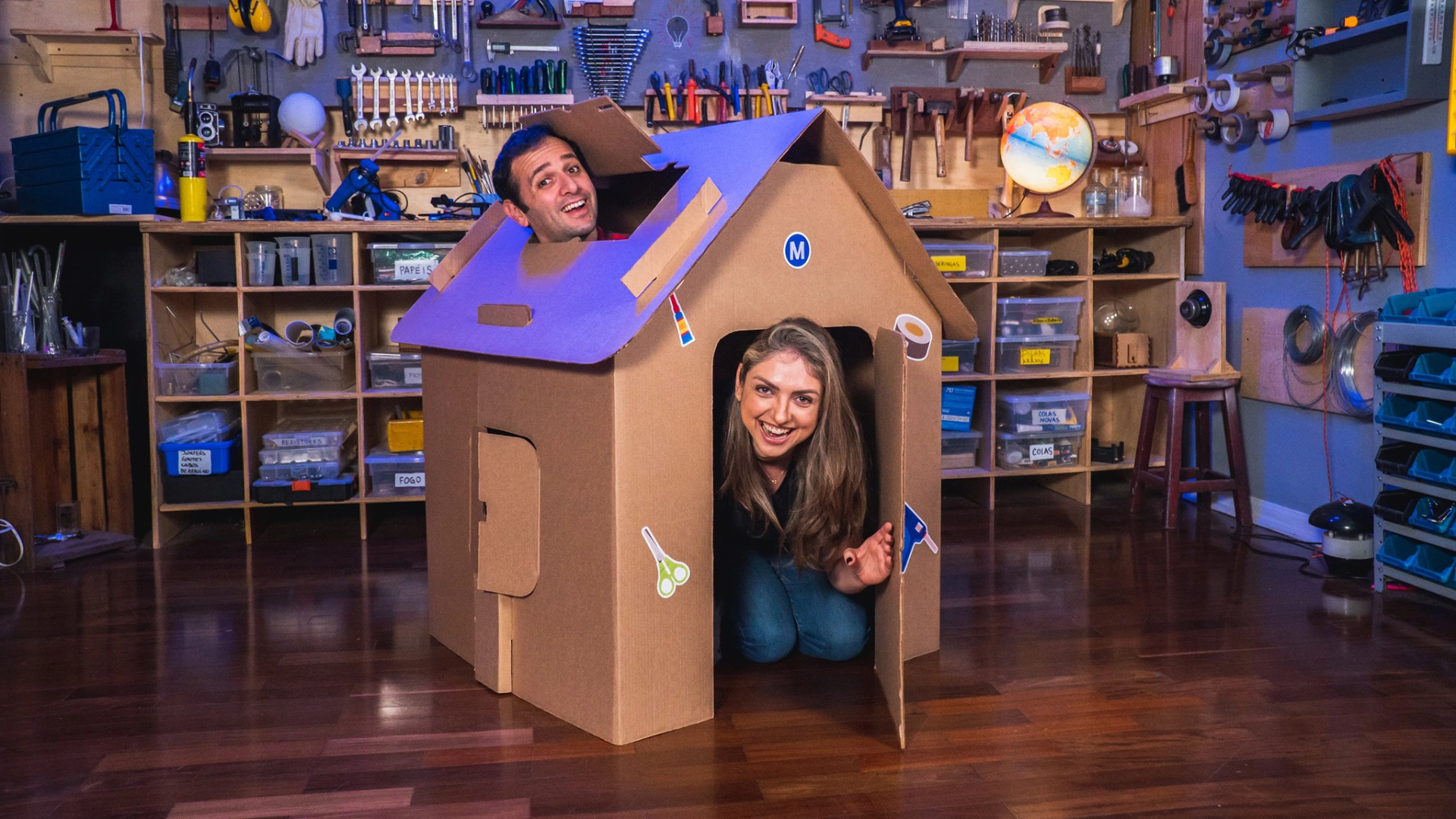
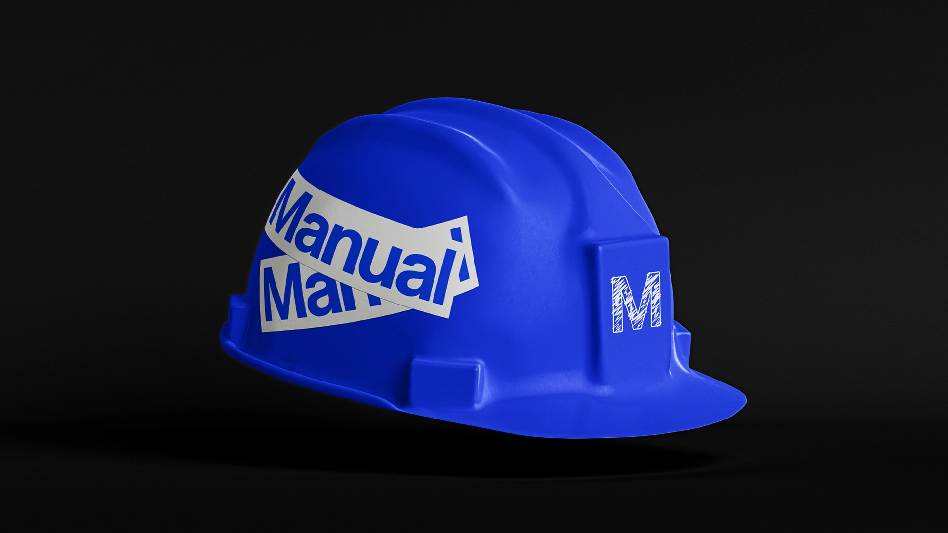
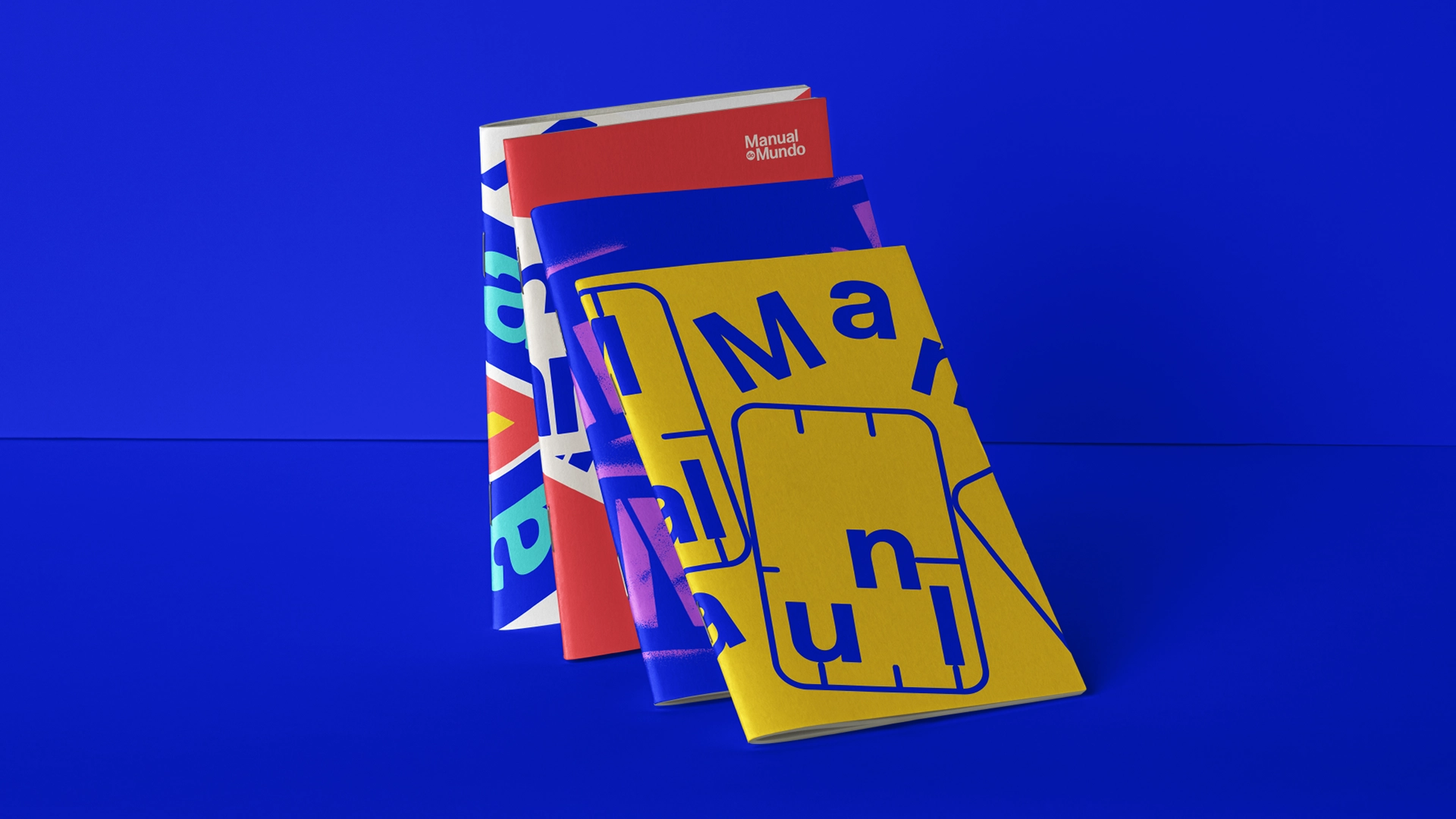
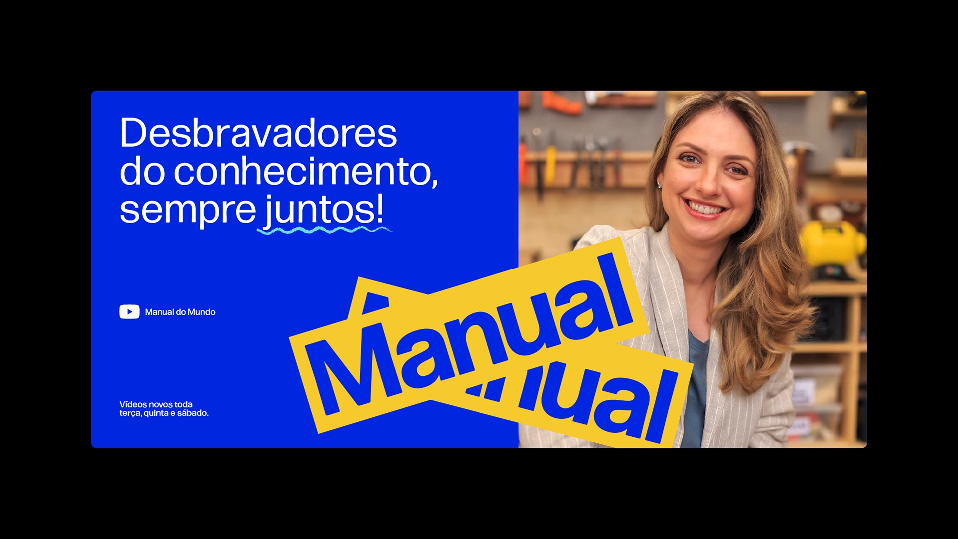
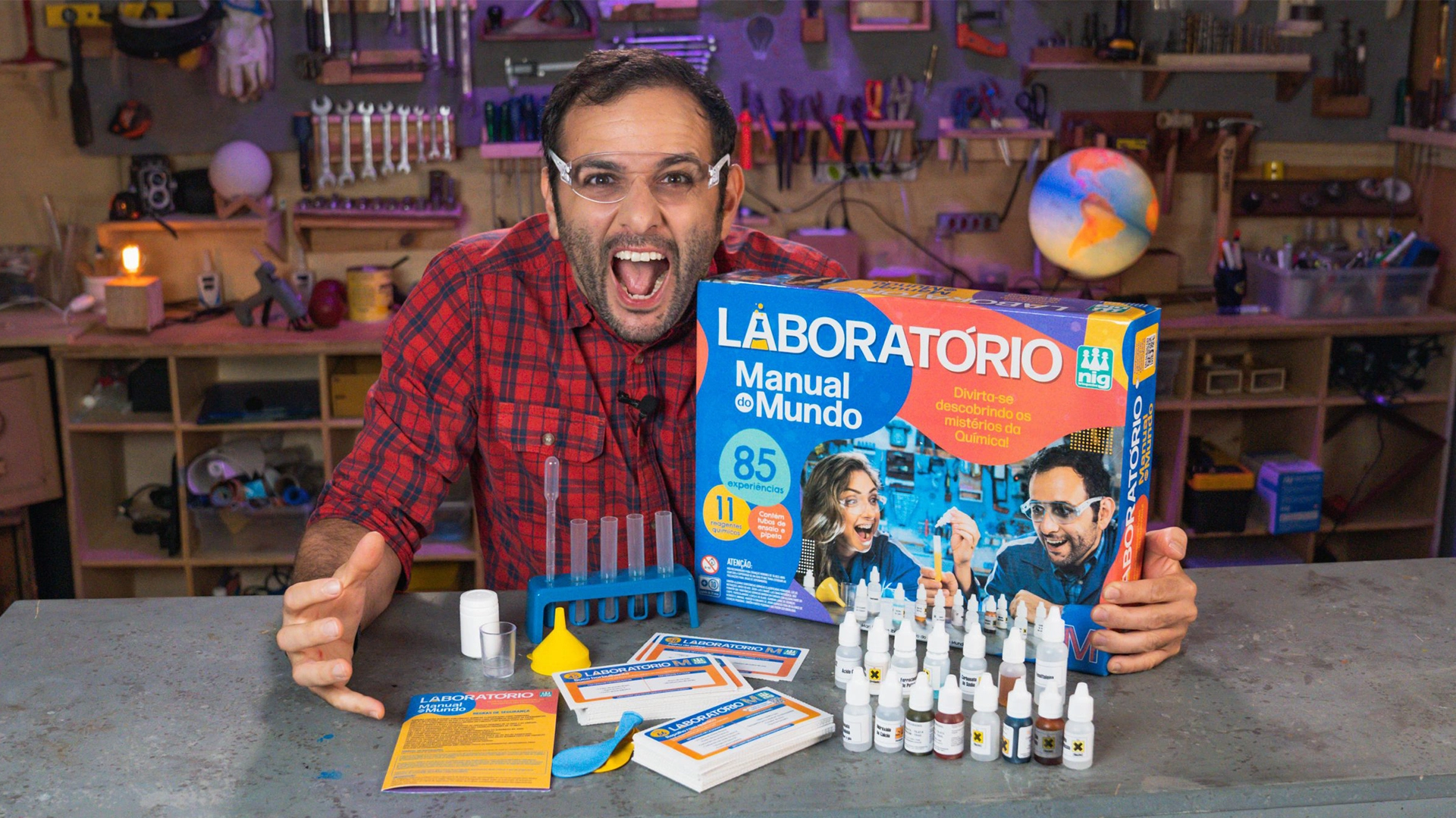
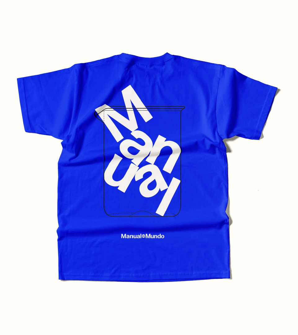
→ Relevant and consistent since 2008, Iberê and Mari, creators of the Manual do Mundo channel, have reached the level of the largest science and technology channel in Brazil. The channel grew and the language ended up getting dated. The brand, with the visual representation of the experiences that the channel carried out, made the visual codes childish, limiting its dialogue with different audiences. It was necessary to evolve to expand its operations and build its brand personality beyond its creators and presenters. With that in mind, we developed a dynamic logo and a visual identity that reinforces the channel's experimental and pioneering, losing the perception of a children's brand and dialoguing with different audiences, regardless of age. The word “Manual” has become a platform for visual experiments, which can be built in different ways.