La Mia
Logo, Visual Identity
→ 2023
Client: La Mia
Agency: Papanapa
Role: Graphic Design, Illustration, Motion
Creative Direction: Gustavo Garcia
Team: Cassia Freire, Gustavo Garcia, Gustavo Kone, Luana Cordeiro, Lucas Rodrigues
Positioning and Verbal Identity: Renata Monteiro (Criatexto)
3D: Lukas Kawakami
Photography: Livia Wu, Ernani Mesquita, Milena Duzzi, Papanapa
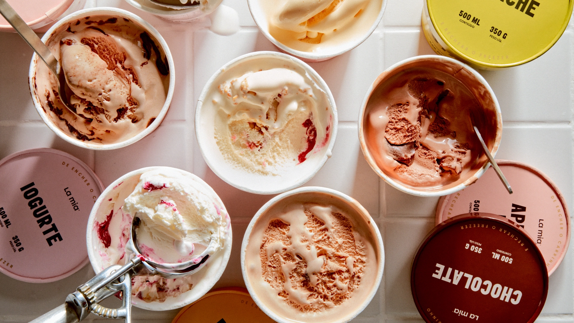
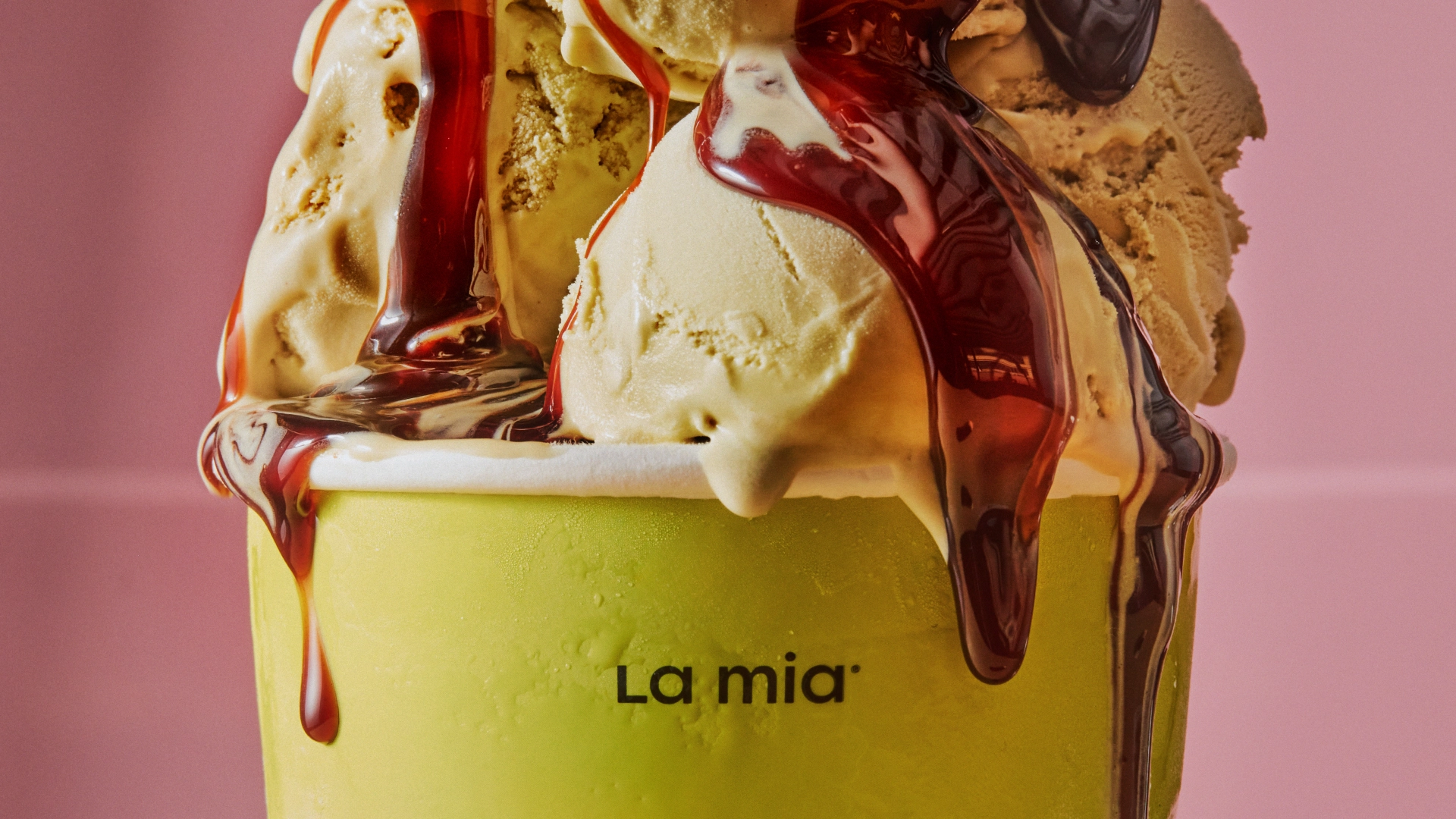
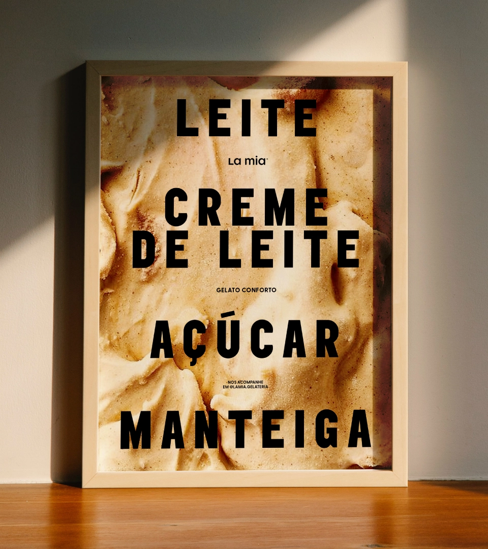
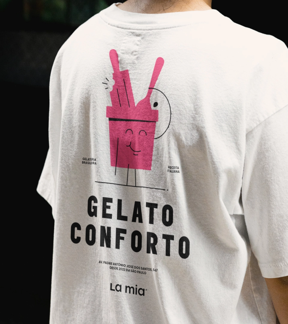
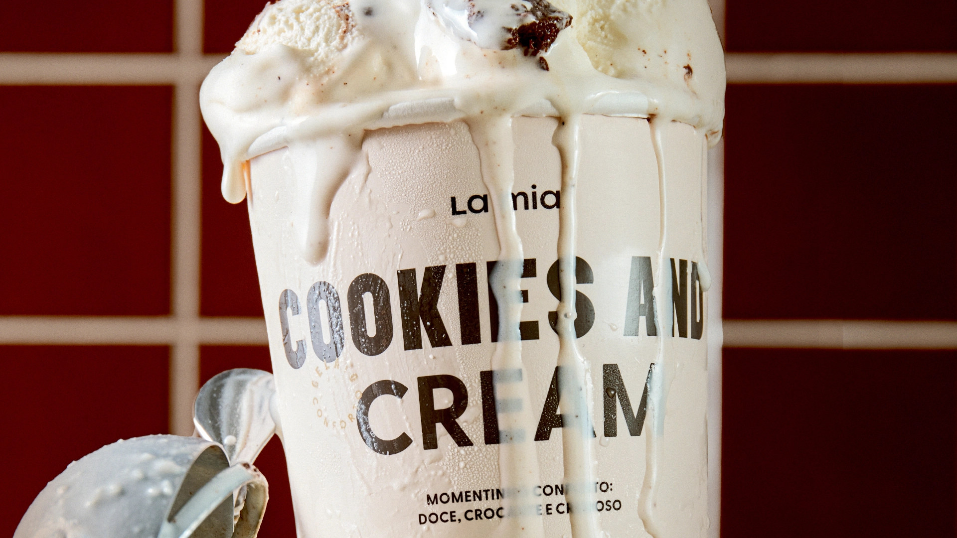
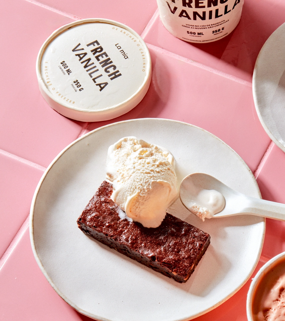
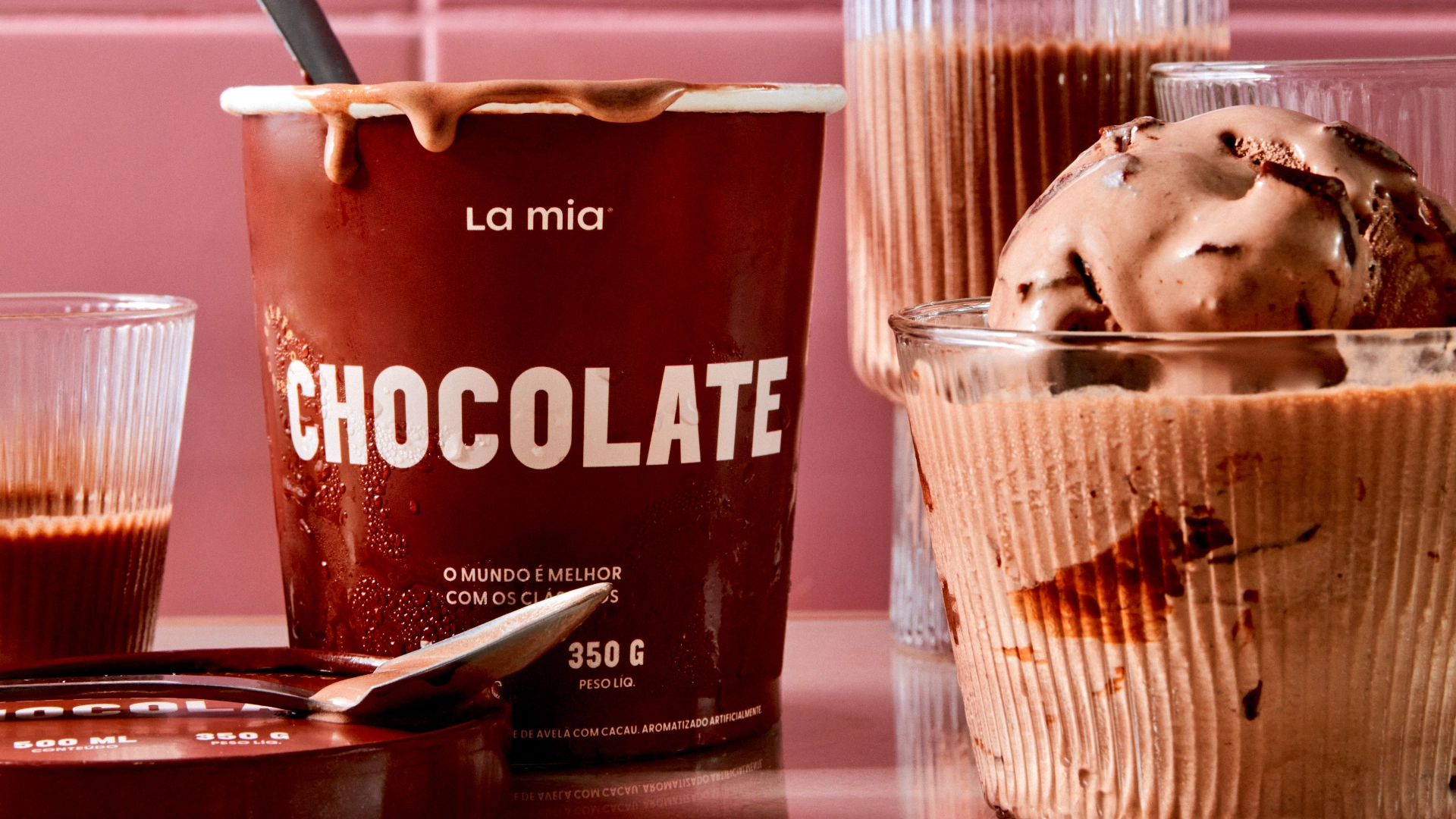
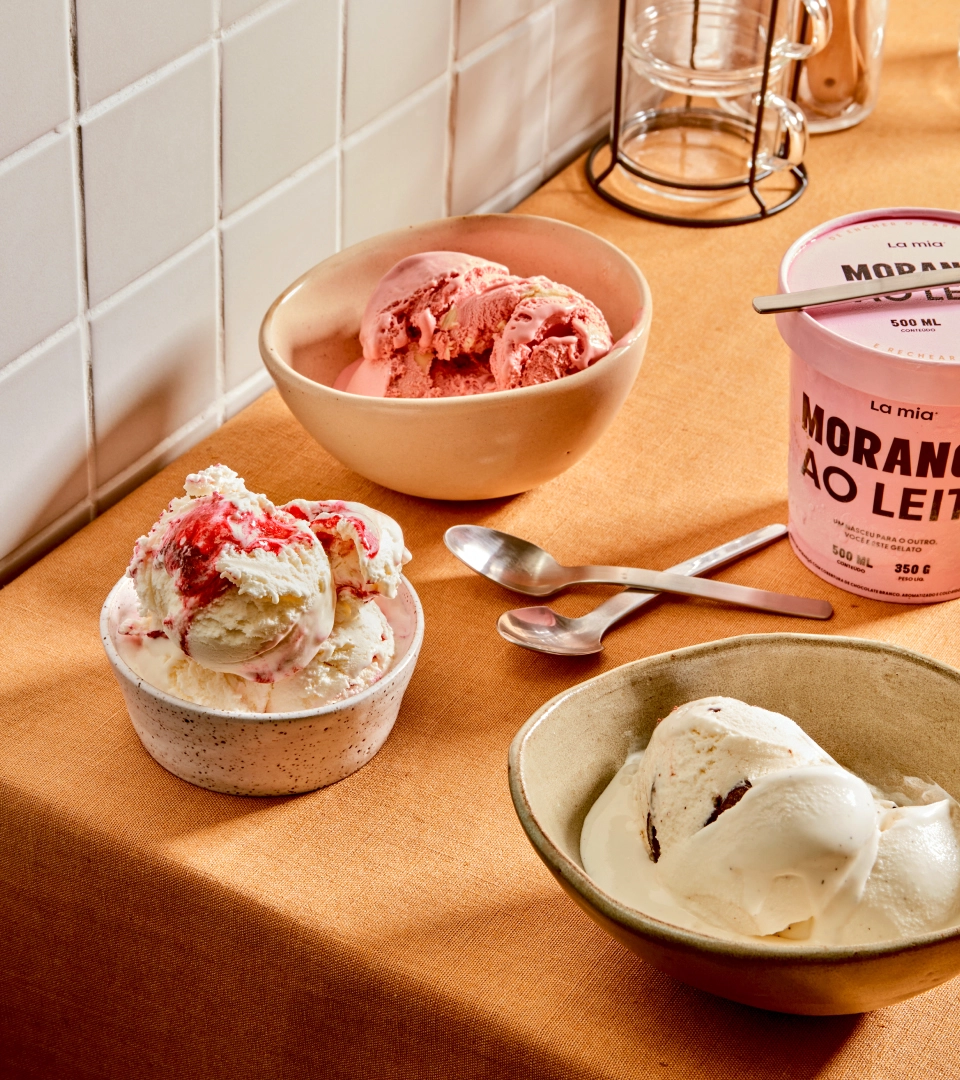
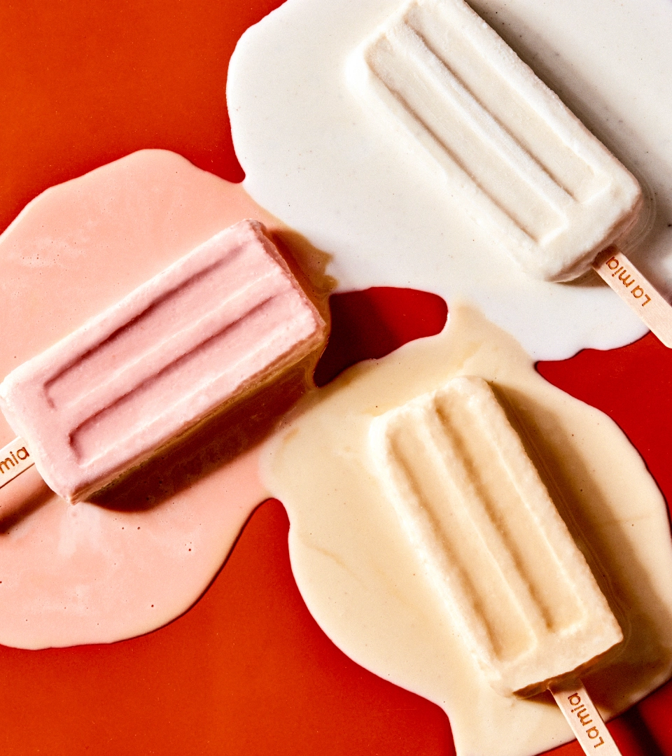
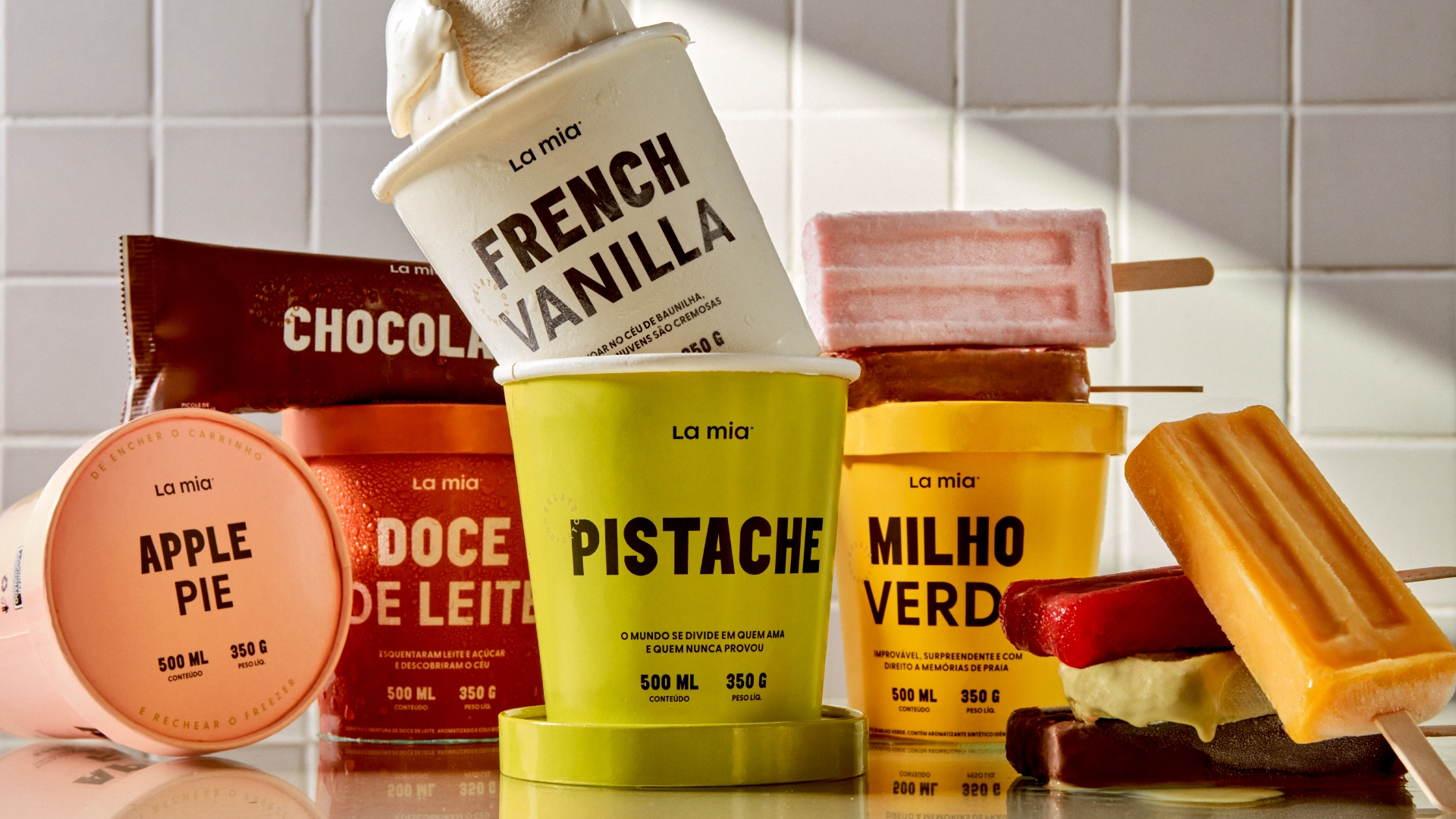
→ Unlike traditional ice cream shops, where people eat on the spot, La Mia is an irresistible self-service store offering more than 50 flavors to fill your basket and freezer, and enjoy with your family. In positioning, it was essential to communicate attributes such as accessibility in price, sophistication in experience, and made-to-consume at home. We arrived at the simple and sensorial tagline: “Gelato Conforto”.
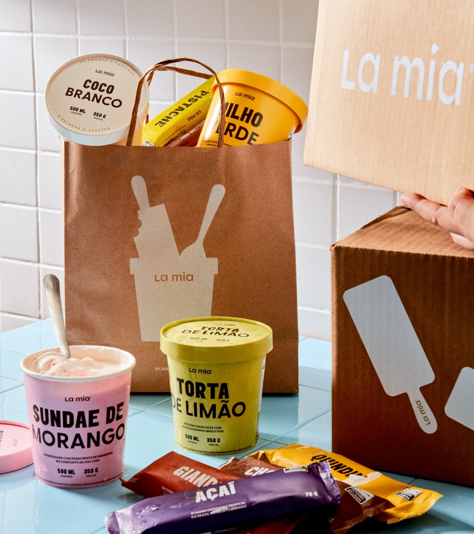
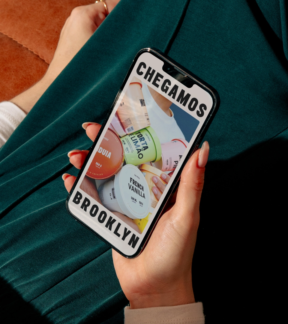
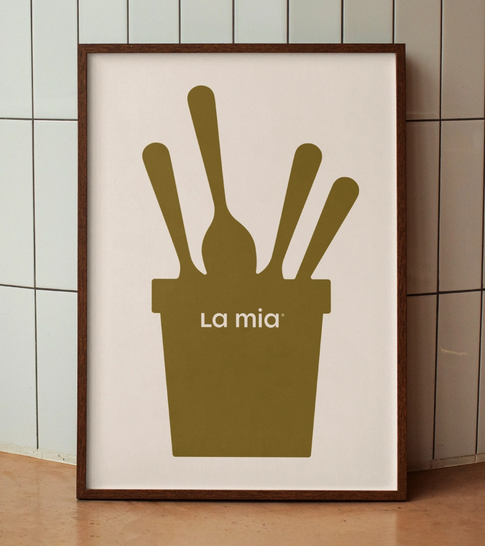
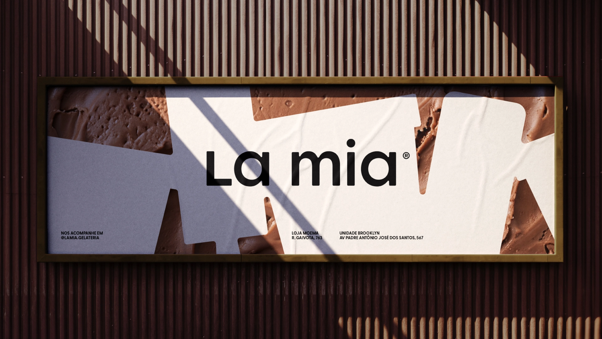
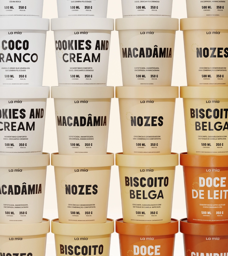
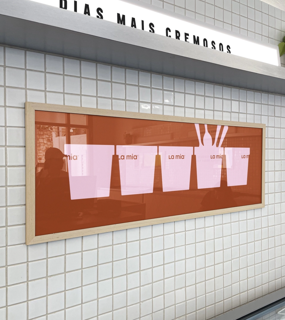
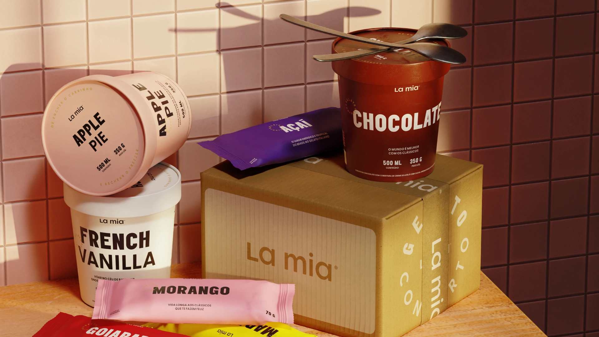
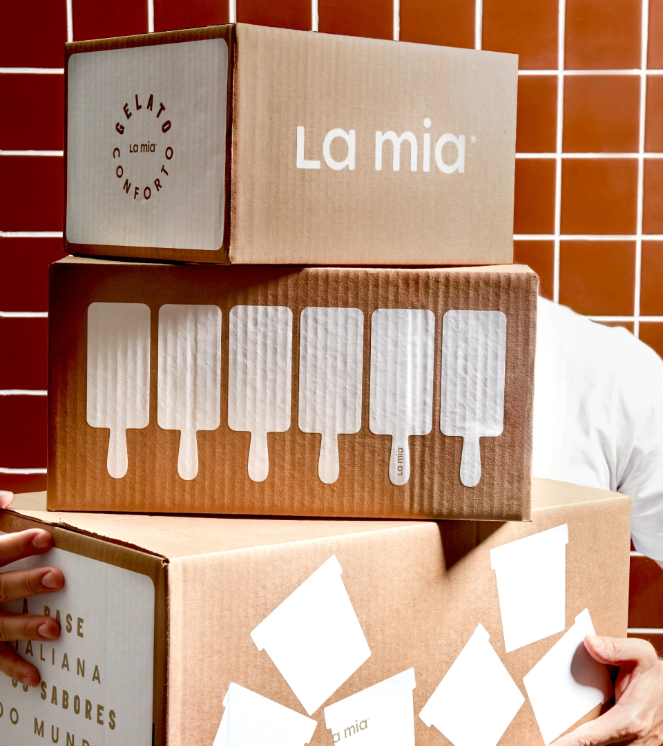
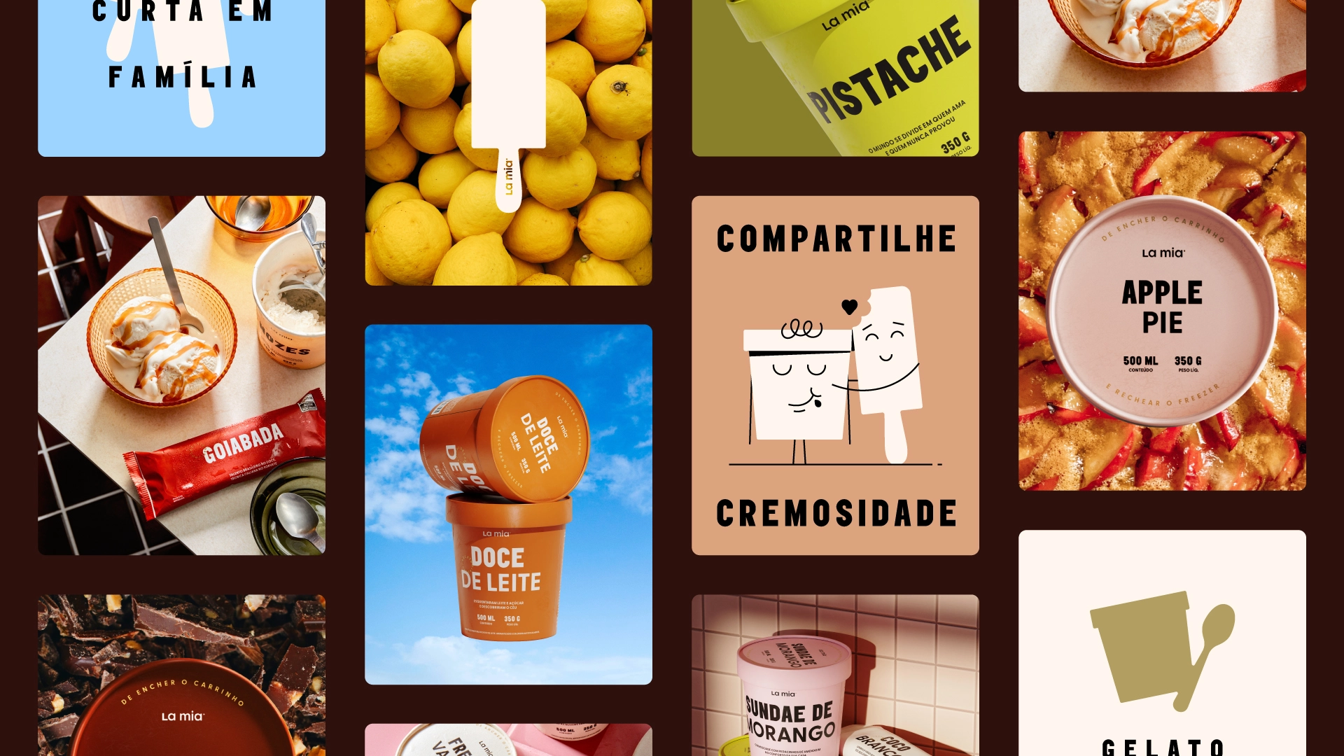
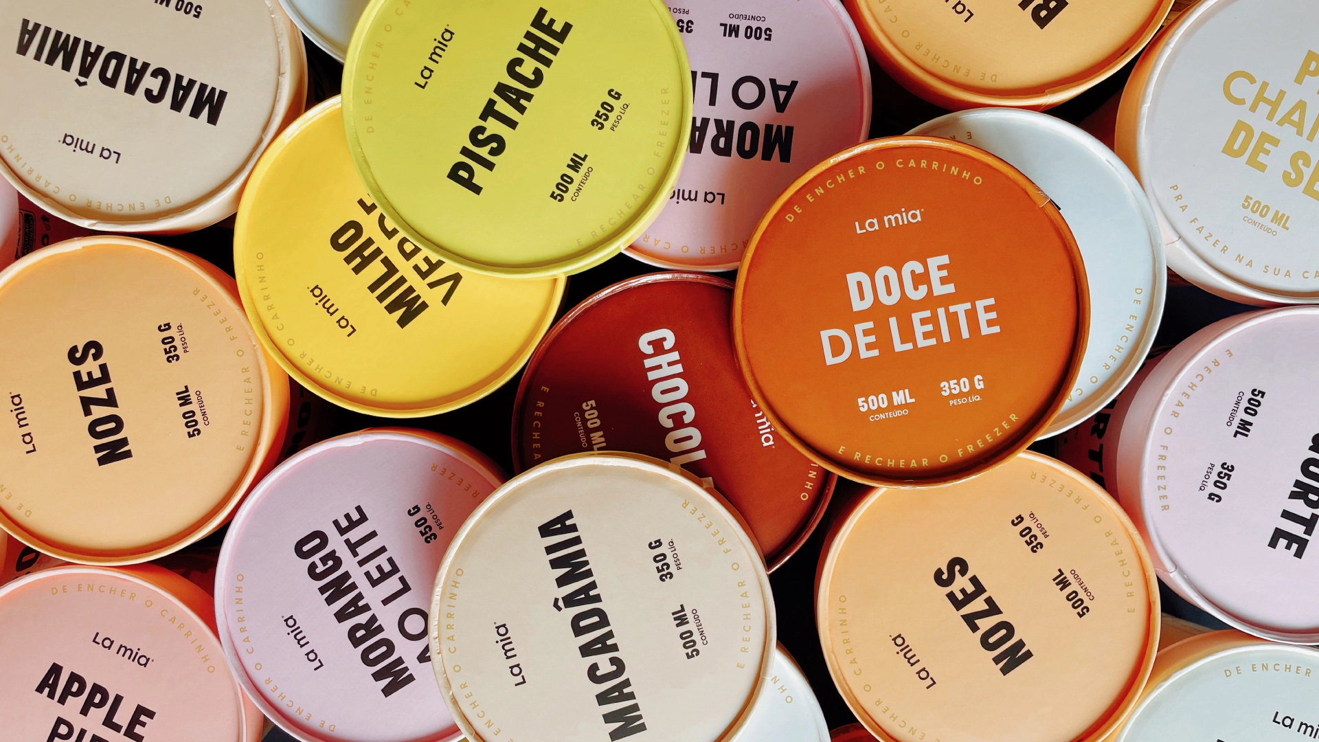
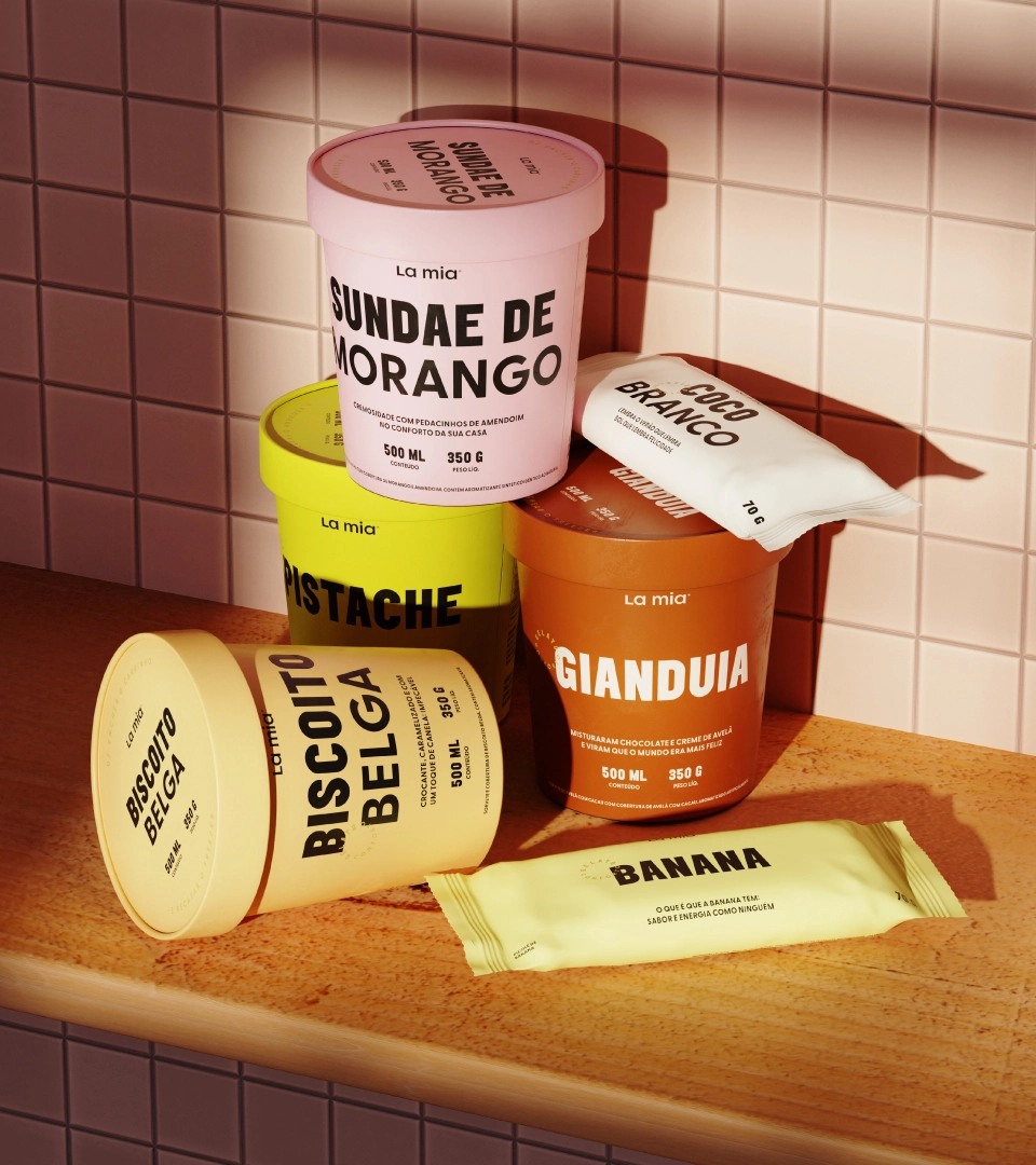
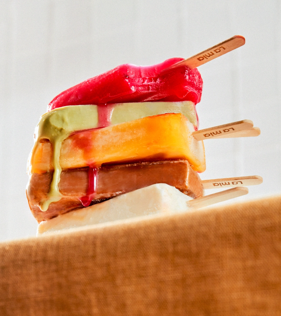
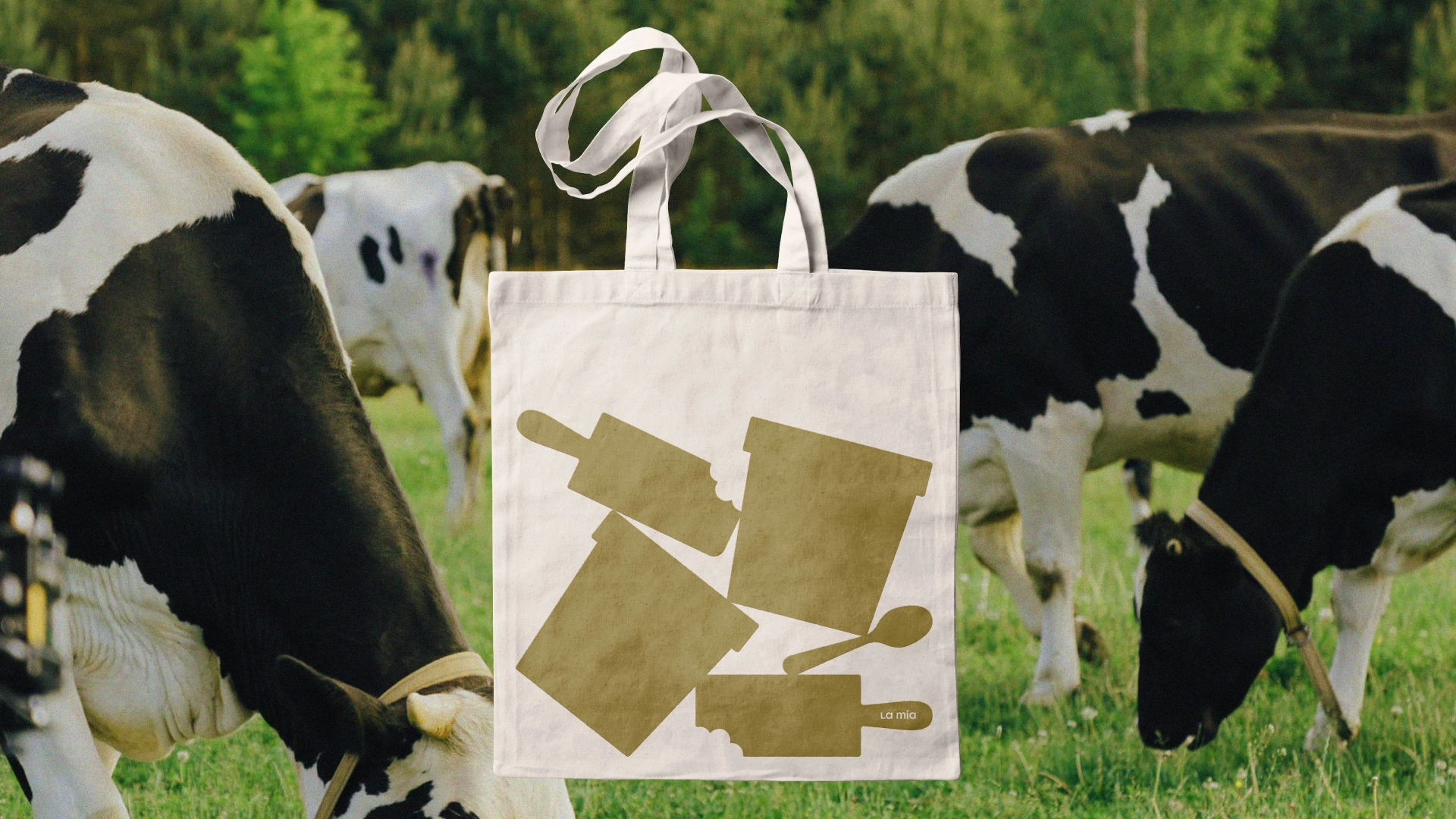
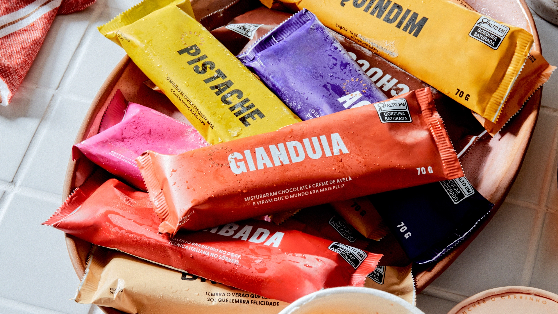
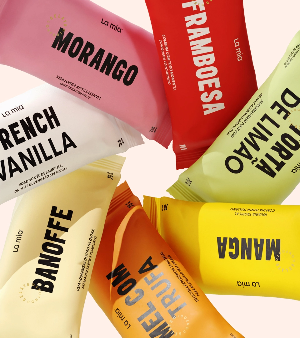
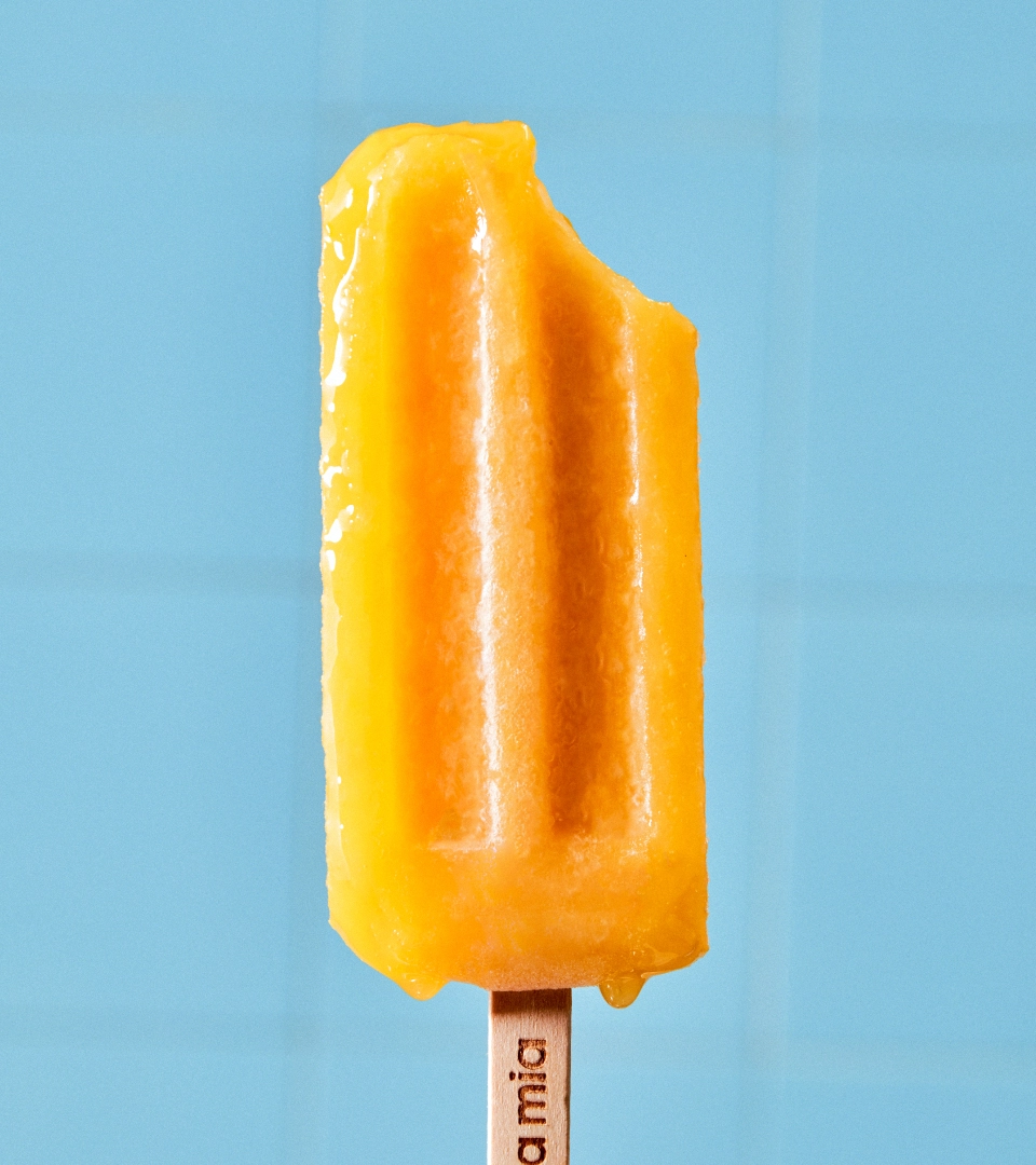
With the brand narrative defined, we created a simple and light wordmark that reflects the pure essence of La Mia. For the visual identity system, in addition to an extensive color palette relating to each of the flavors and a surprising typographic combination, Papanapa created a series of illustrations of containers and popsicles interacting in delicate compositions. Its use on packaging, posters, social media, and uniforms gives the brand a unique and fun presence. Emphasizing its welcoming personality, La Mia is already charismatic and distinct, ready to win the hearts of ice cream enthusiasts and comfortable moments.

