

Geopagos
Logo, Visual Identity
→ 2022
Client: Geopagos
Agency: Papanapa
Role: Graphic Design, Motion Graphics
Team: Gustavo Garcia, Lucas Rodrigues, Renata Monteiro
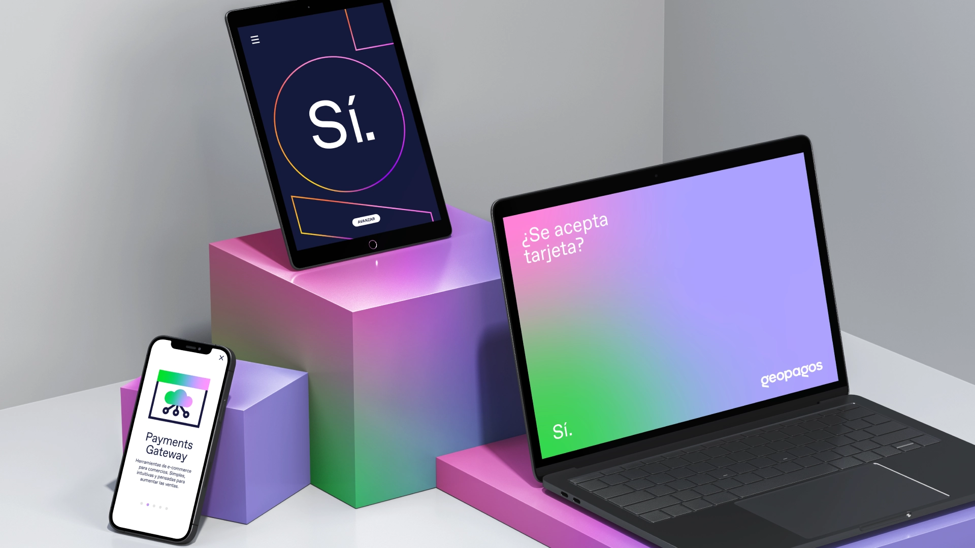
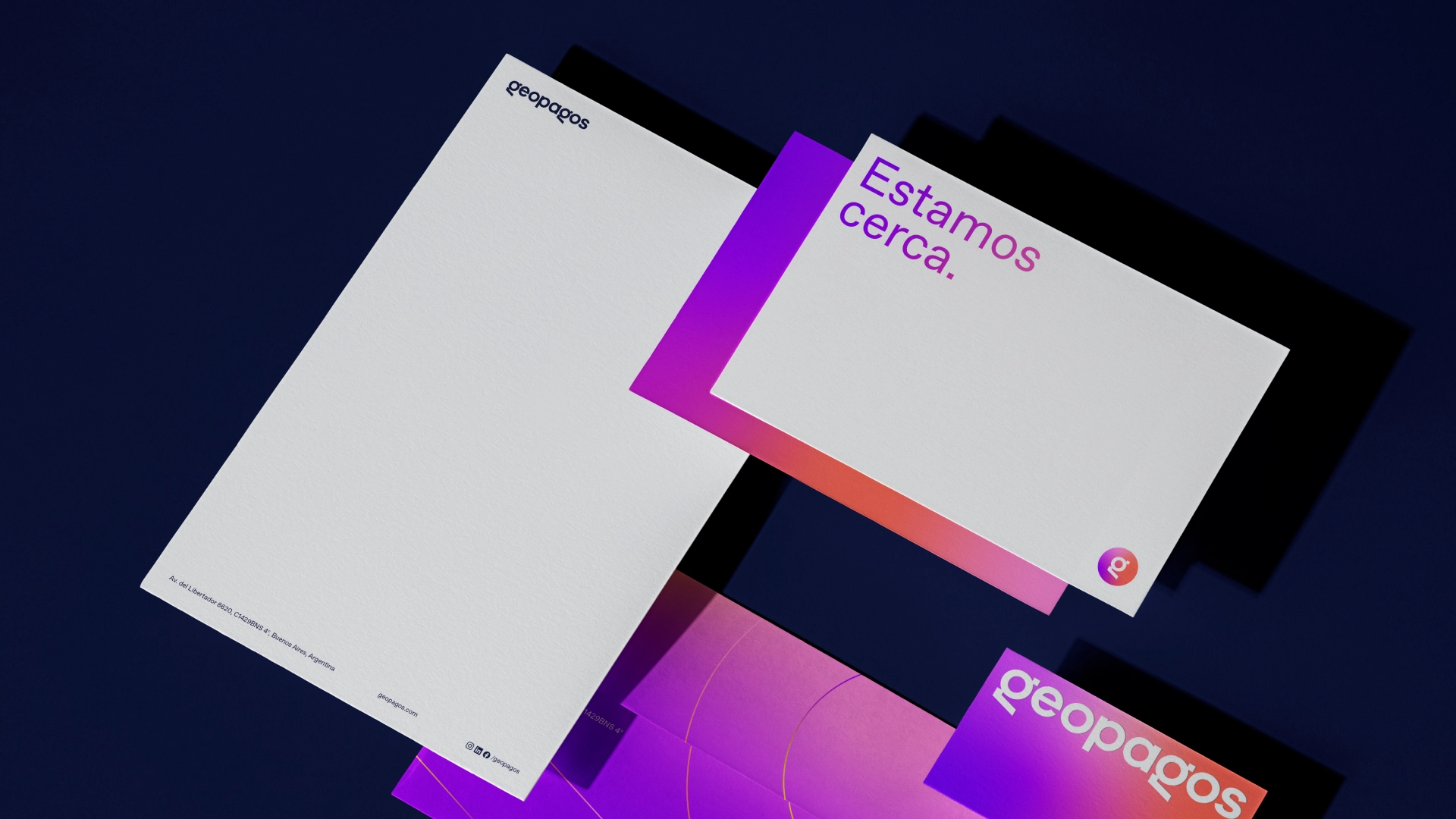
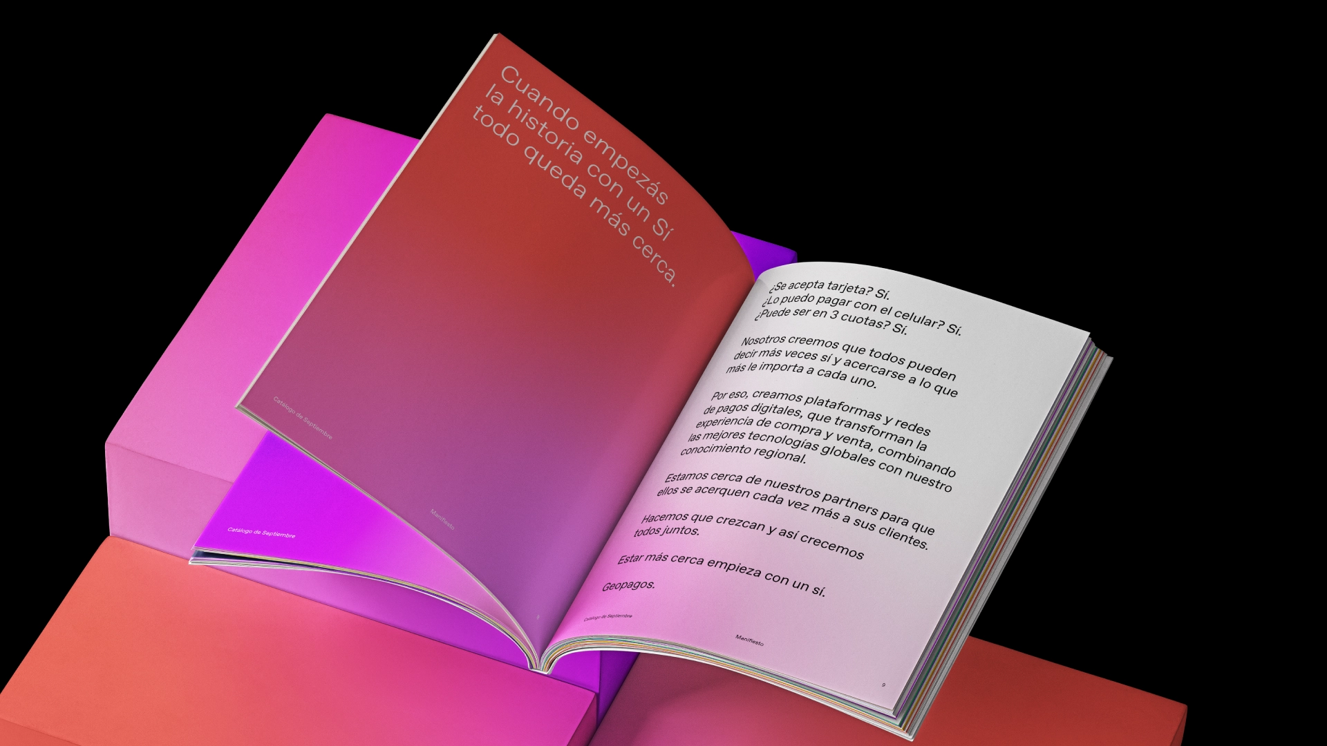
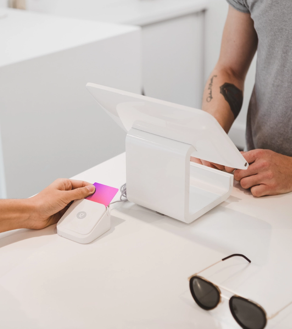
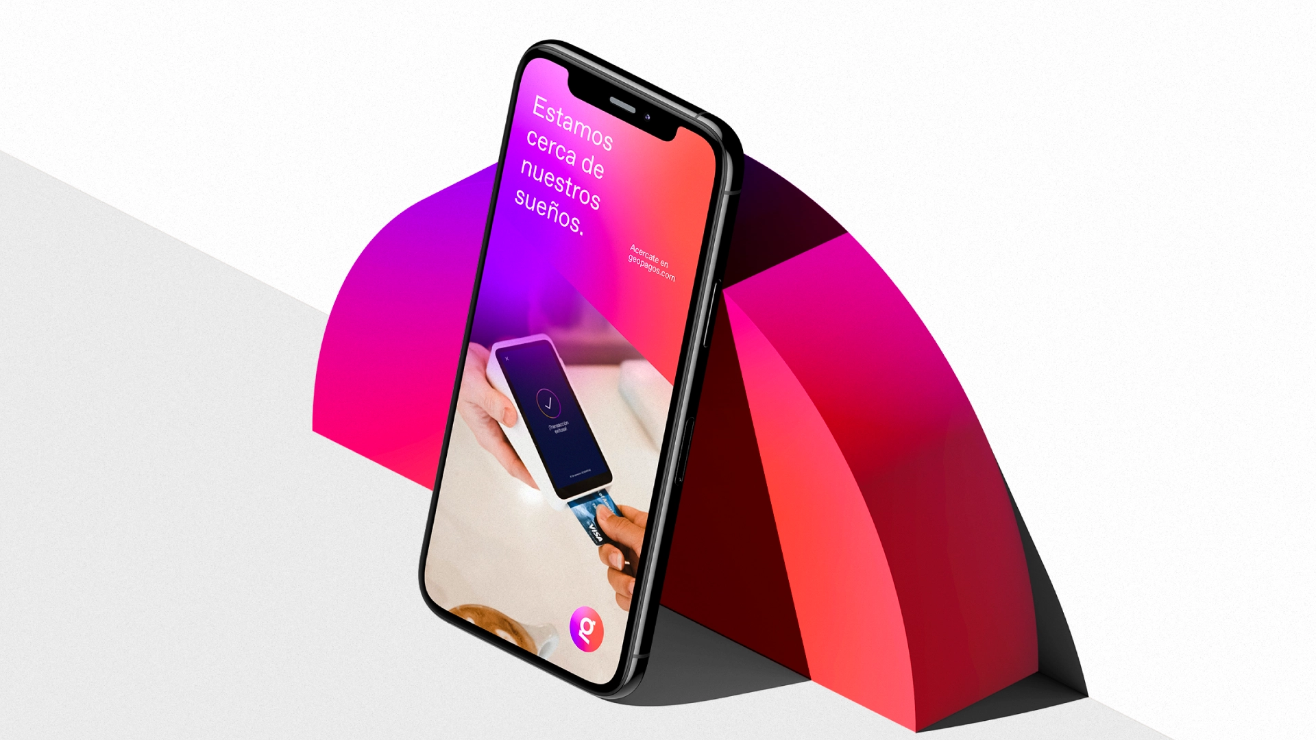
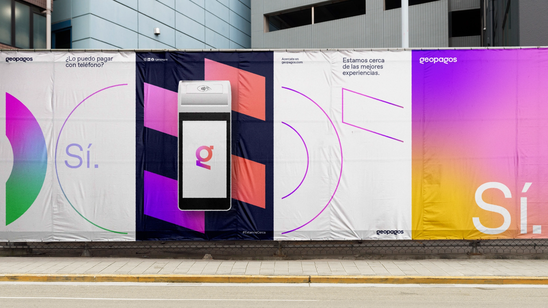
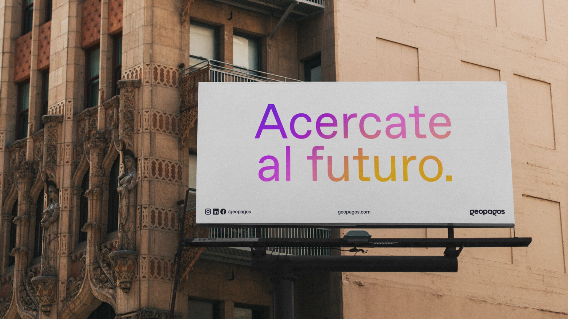
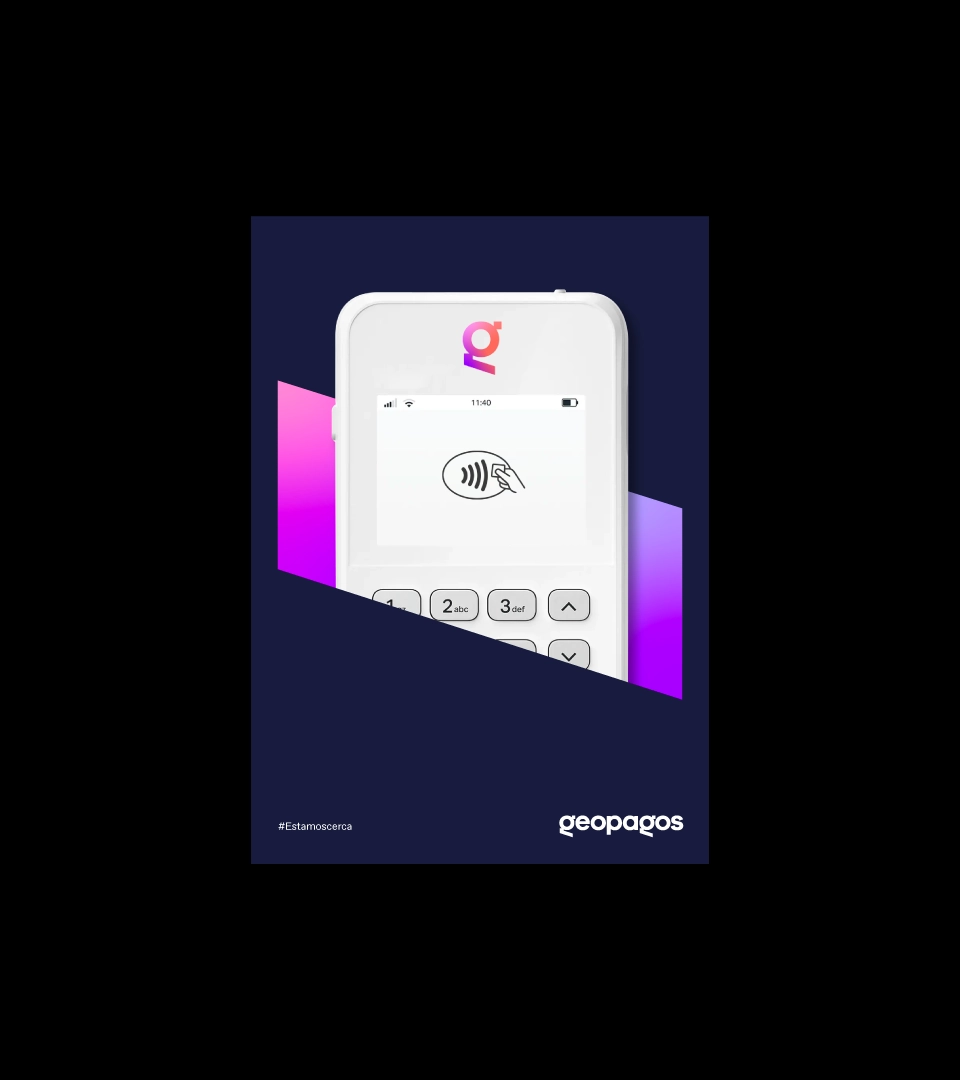
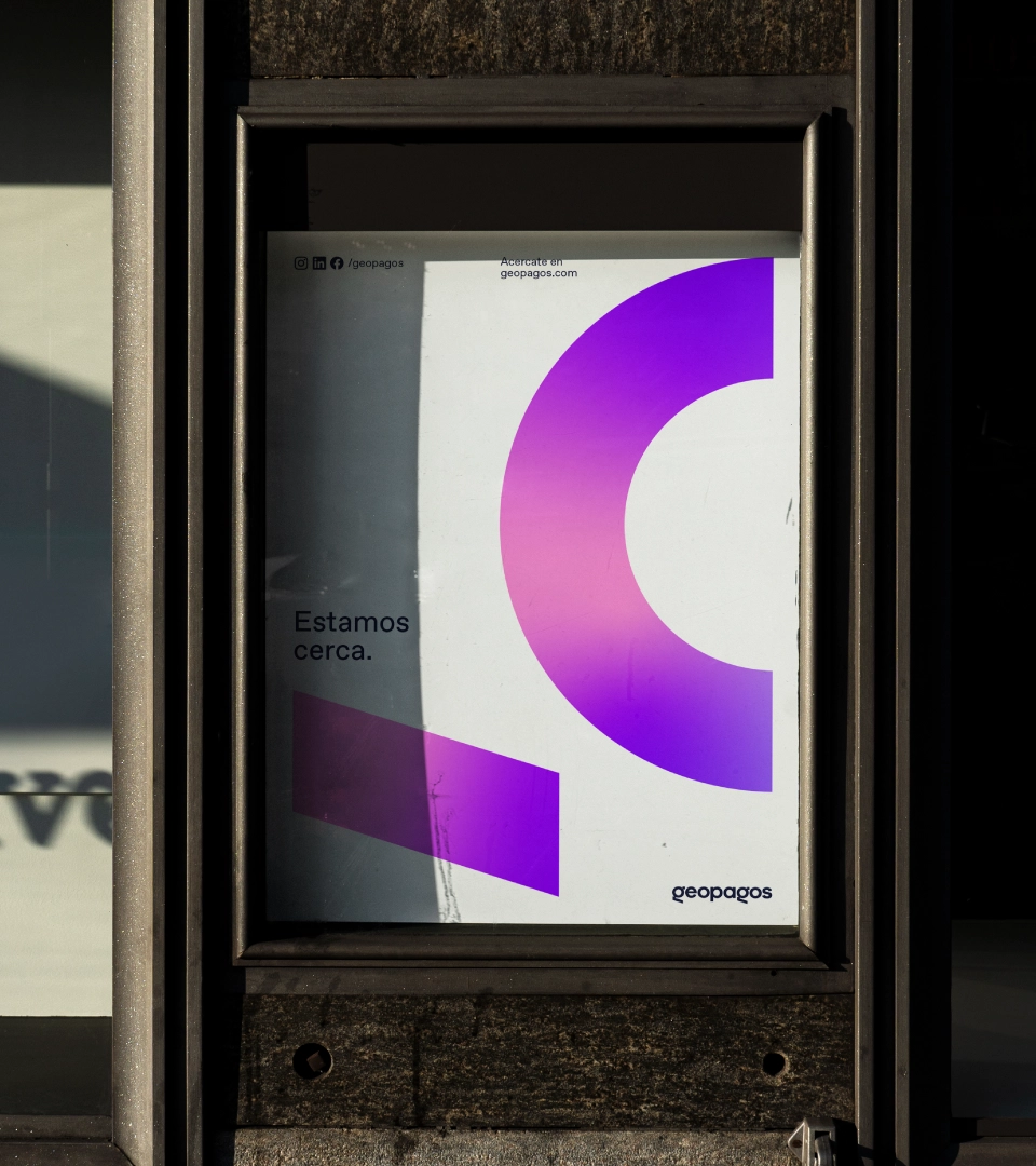
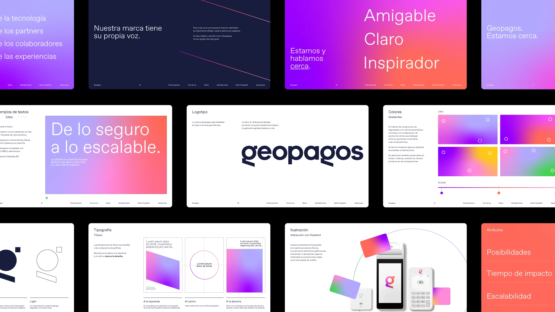
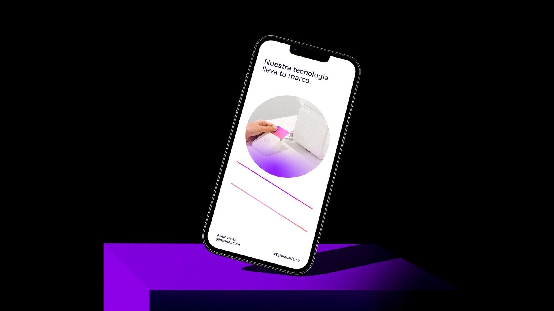
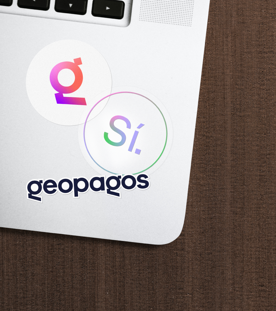
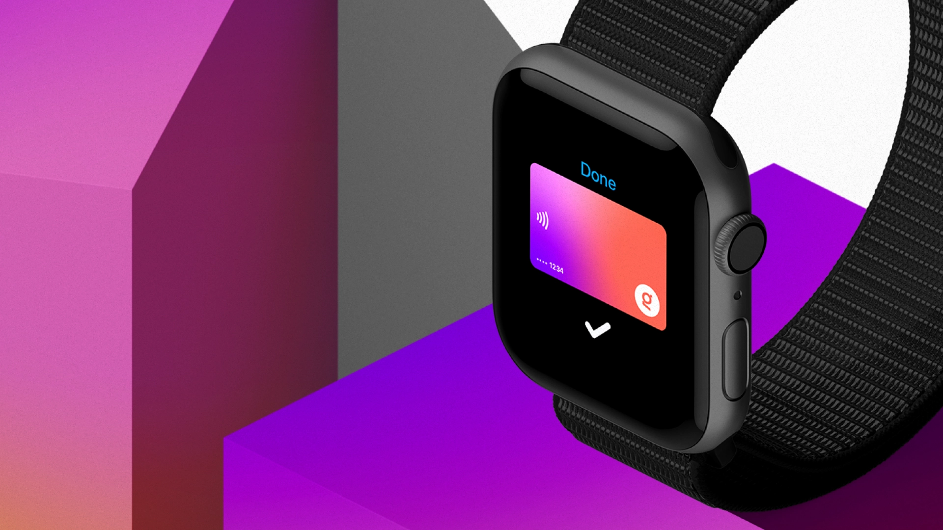
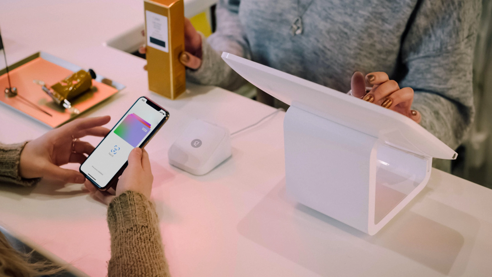
→ The fintech world seems to share many similar languages and clichés. It was necessary to dig deep to understand what was really unique about Geopagos. Far beyond customized digital payment solutions, the company allows people and businesses to be close: to innovation, customers, experiences, and the world. With the phrase “Estamos cerca” (We are close, in English), we positioned and expanded the possibilities of the brand narratives, allowing it to grow together with its partners and the entire community. We also appropriated the word “Sí” (Yes), which is the desired answer to questions like: Do you accept cards? Can I pay in installments? Can I pay with my phone? All these ideas are then tied together in the Manifesto by concluding that being closer starts with saying: Yes!
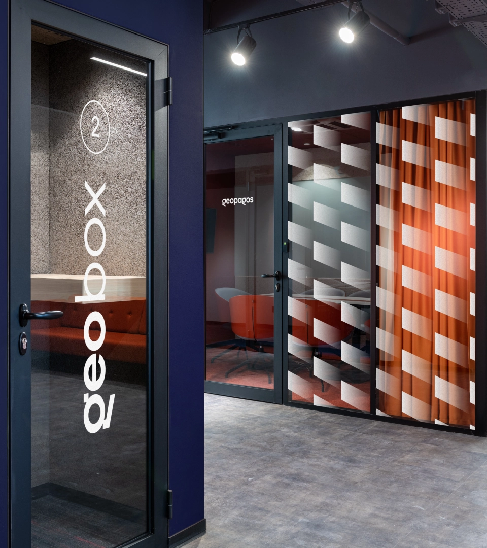
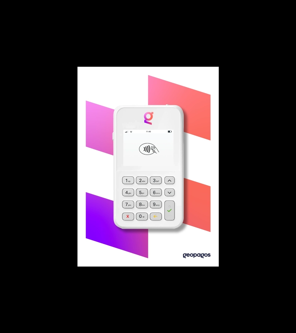
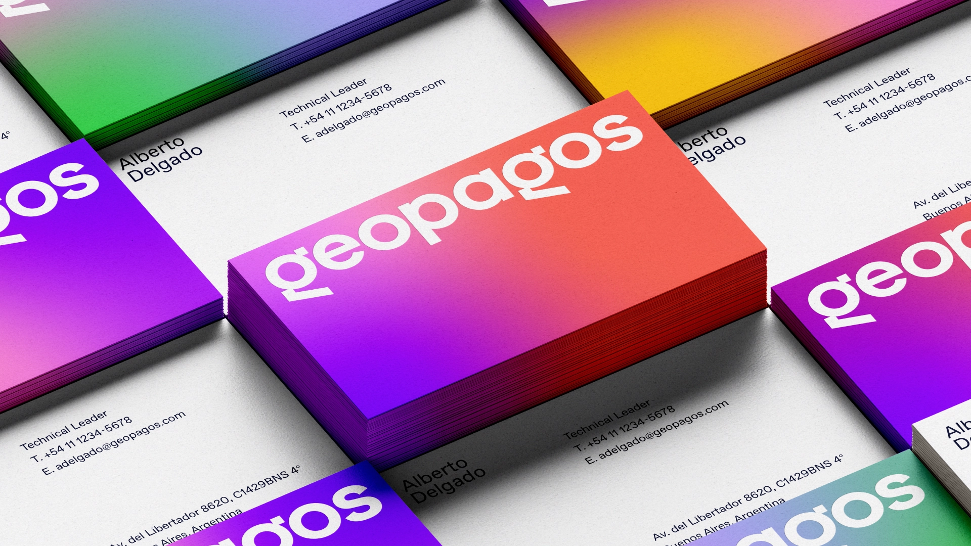
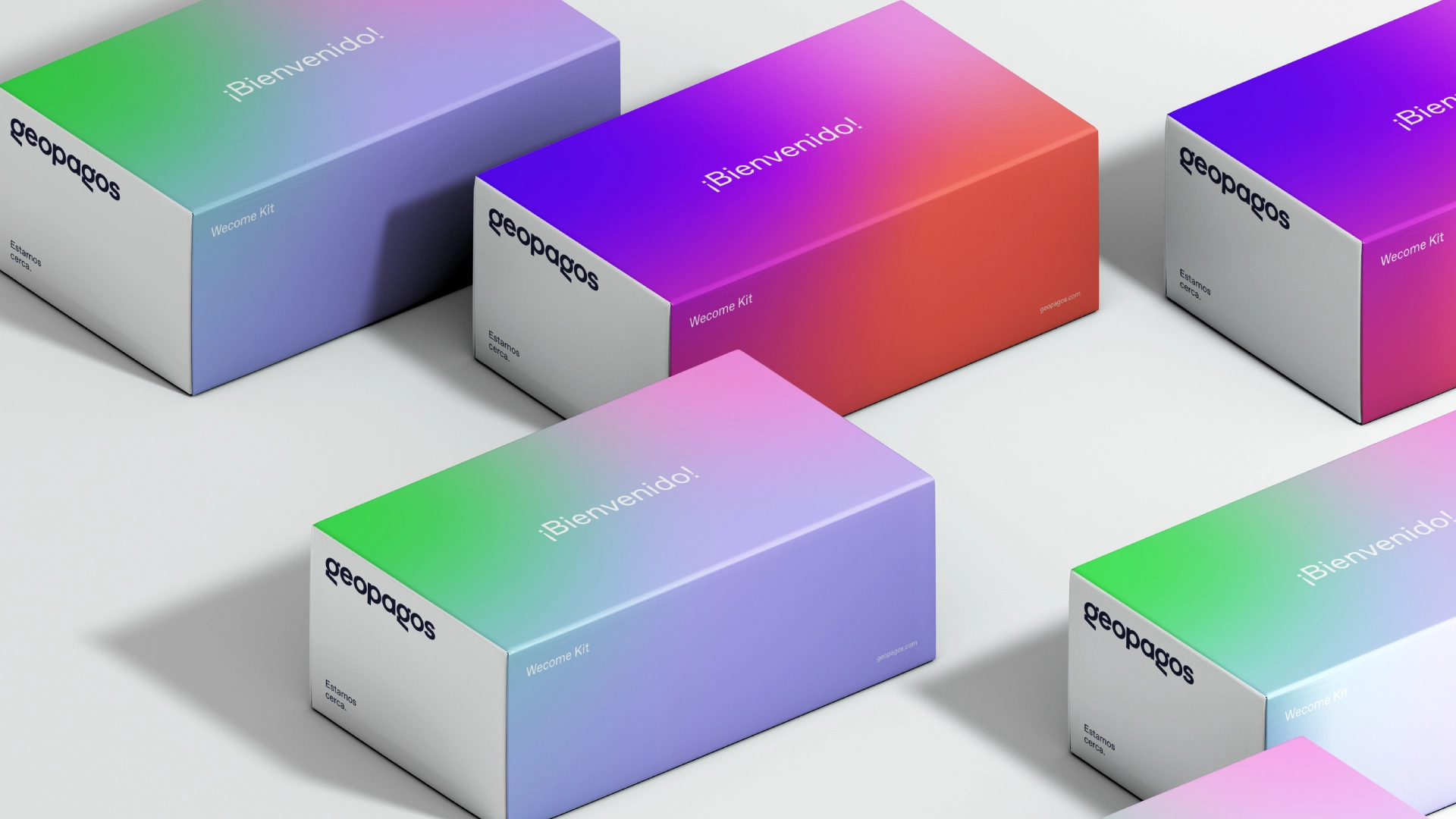
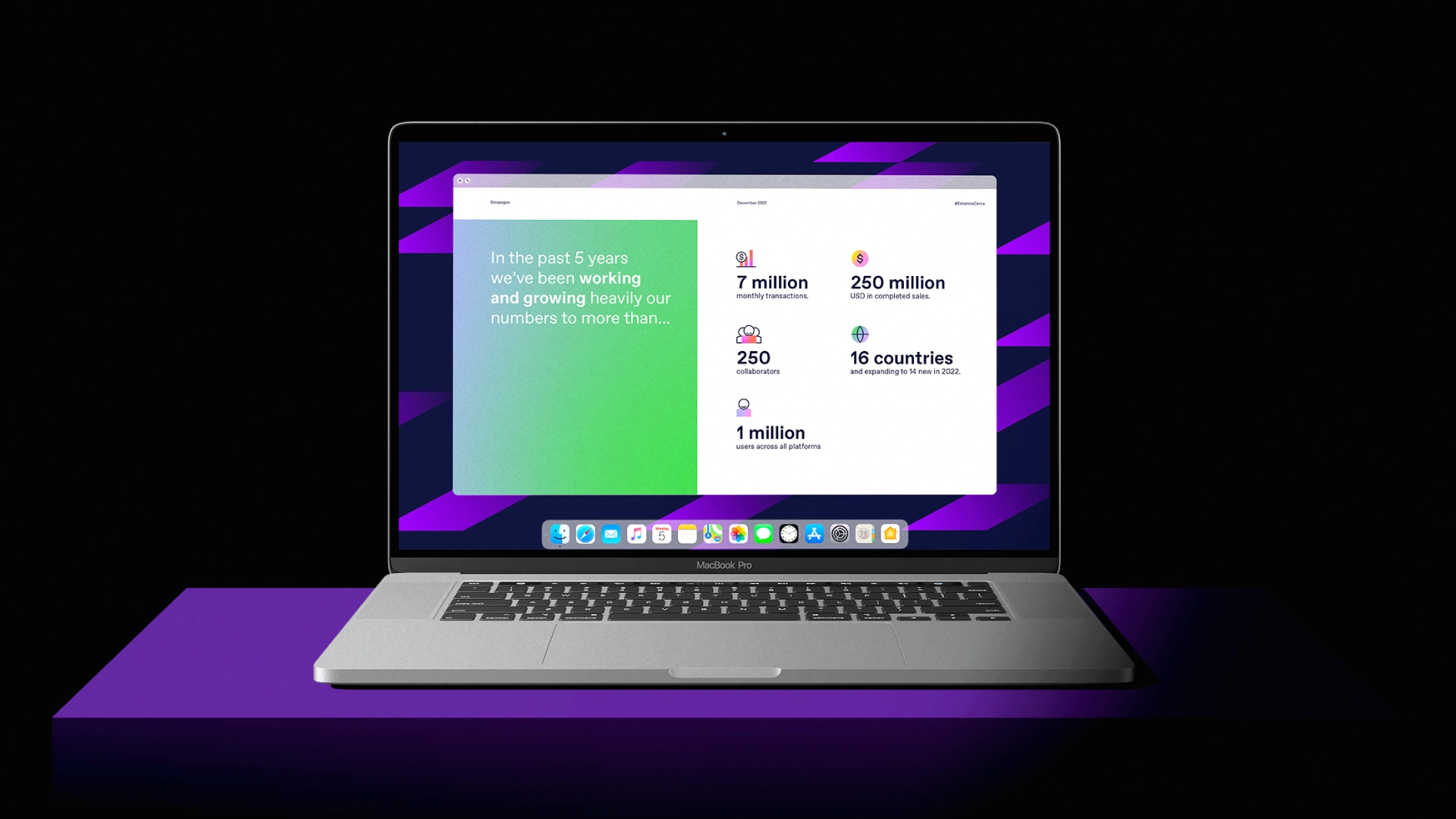
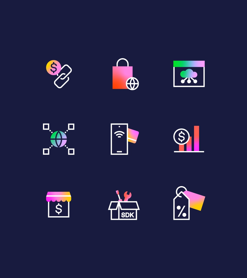
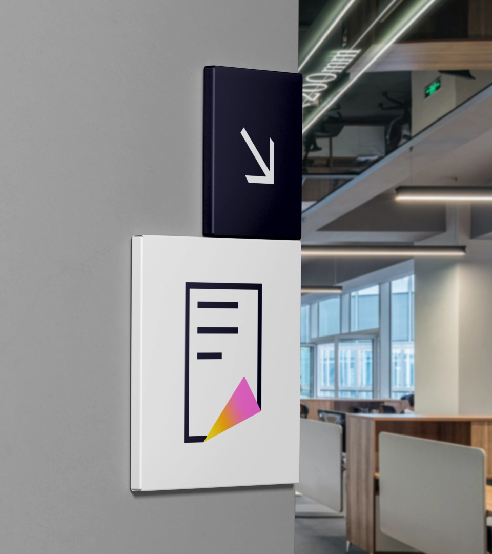
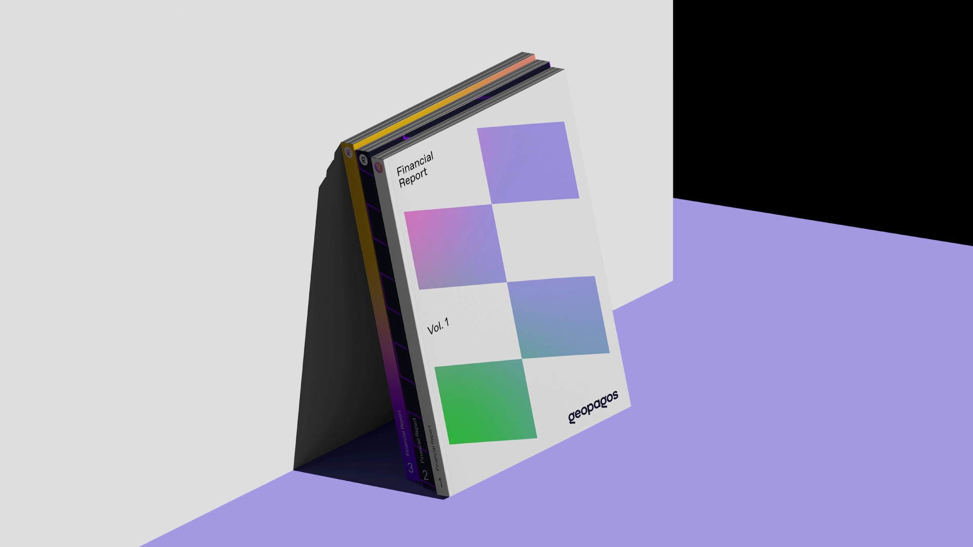
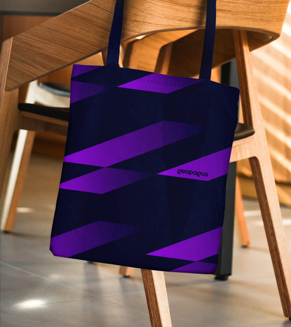
Moving on to the visual phase of Geopagos, the design solution revolutionized every aspect of it. The logo now presents a structure that brings a new spelling format (all in lowercase) while balancing human and technological characteristics by combining rounded shapes and sharp angles. This mixture enlightens the feeling of agility without losing its friendly and universal essence. In the shortened version, with such distinctive attributes, the letter G becomes the symbol for the brand. Aside from bringing movement to the communication and amplifying the experiences promoted by the company, the extensive color palette reflects the adaptability that Geopagos offers to its partners.
2025 © Lucas Rodrigues